The sporty duo Diana and Naz from Canada have joined forces and founded Grindhouse Athletics. Locally, they had already generated a lot of brand awareness, among other things due to their sporting achievements. Now it was time for the next step. Their online presence.
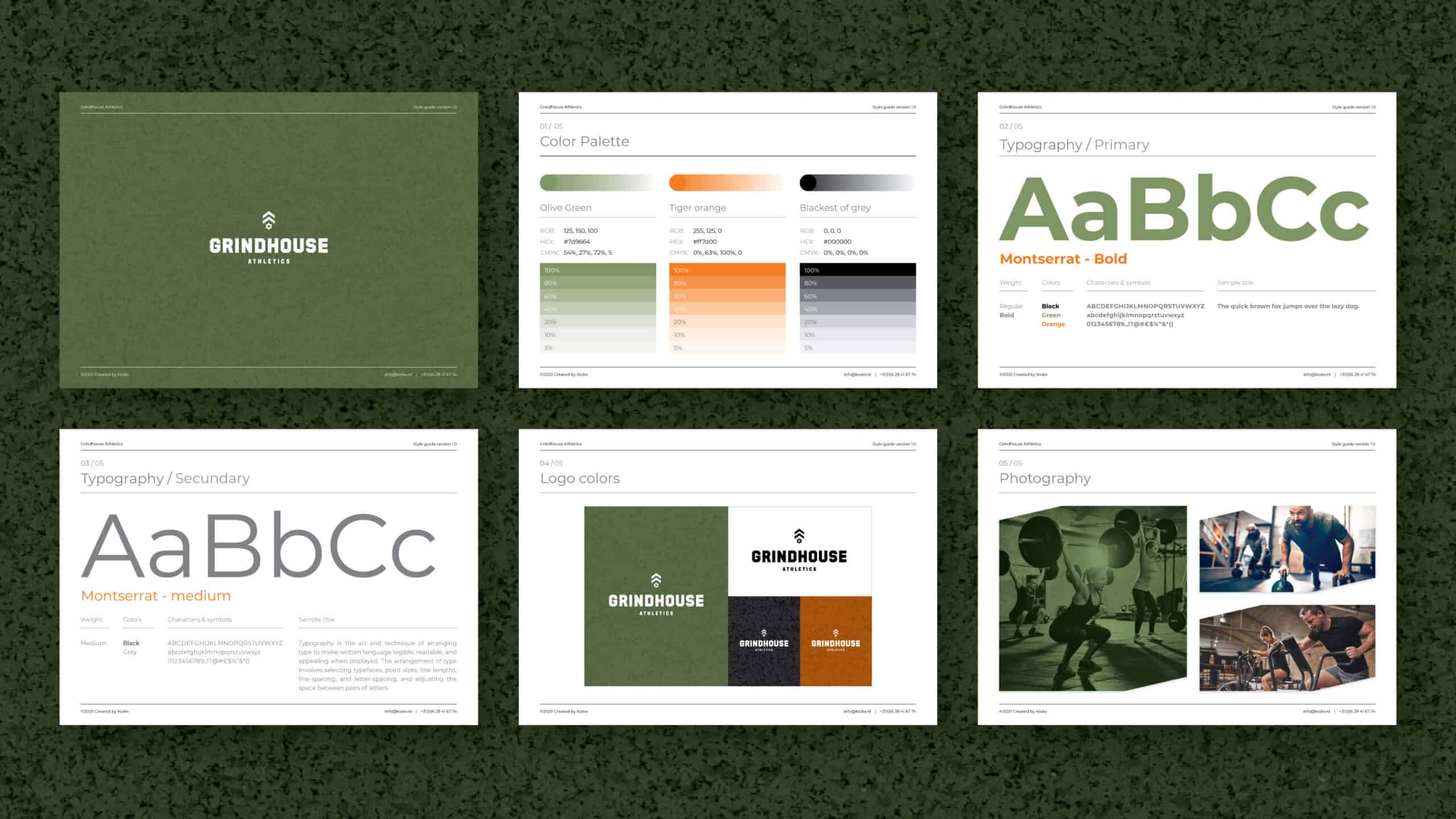
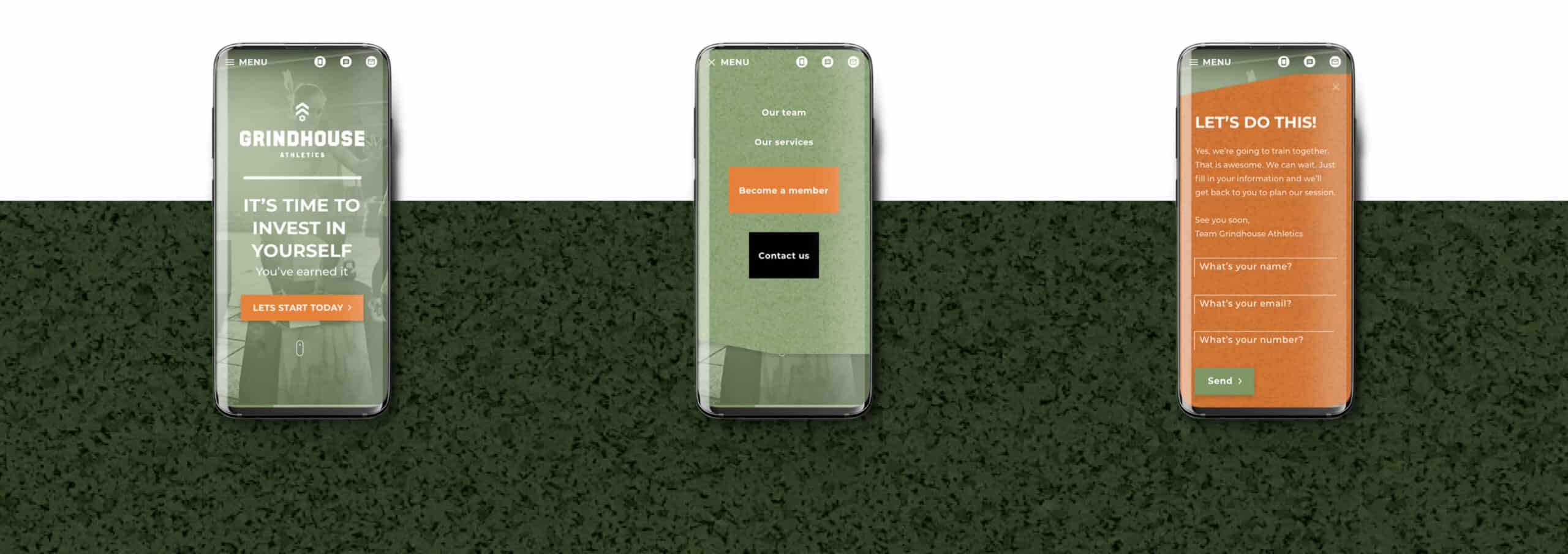
The first step was to develop an identity that felt good for both ladies. The wish was a powerful yet inviting appearance. By using a unique color combination, relatively fine font use, powerful photography and switching between coarse & fine graphic elements, a style has been created that visualizes the warm personalities of the trainers as well as embraces the energetic and purposeful ambitions of the gym.
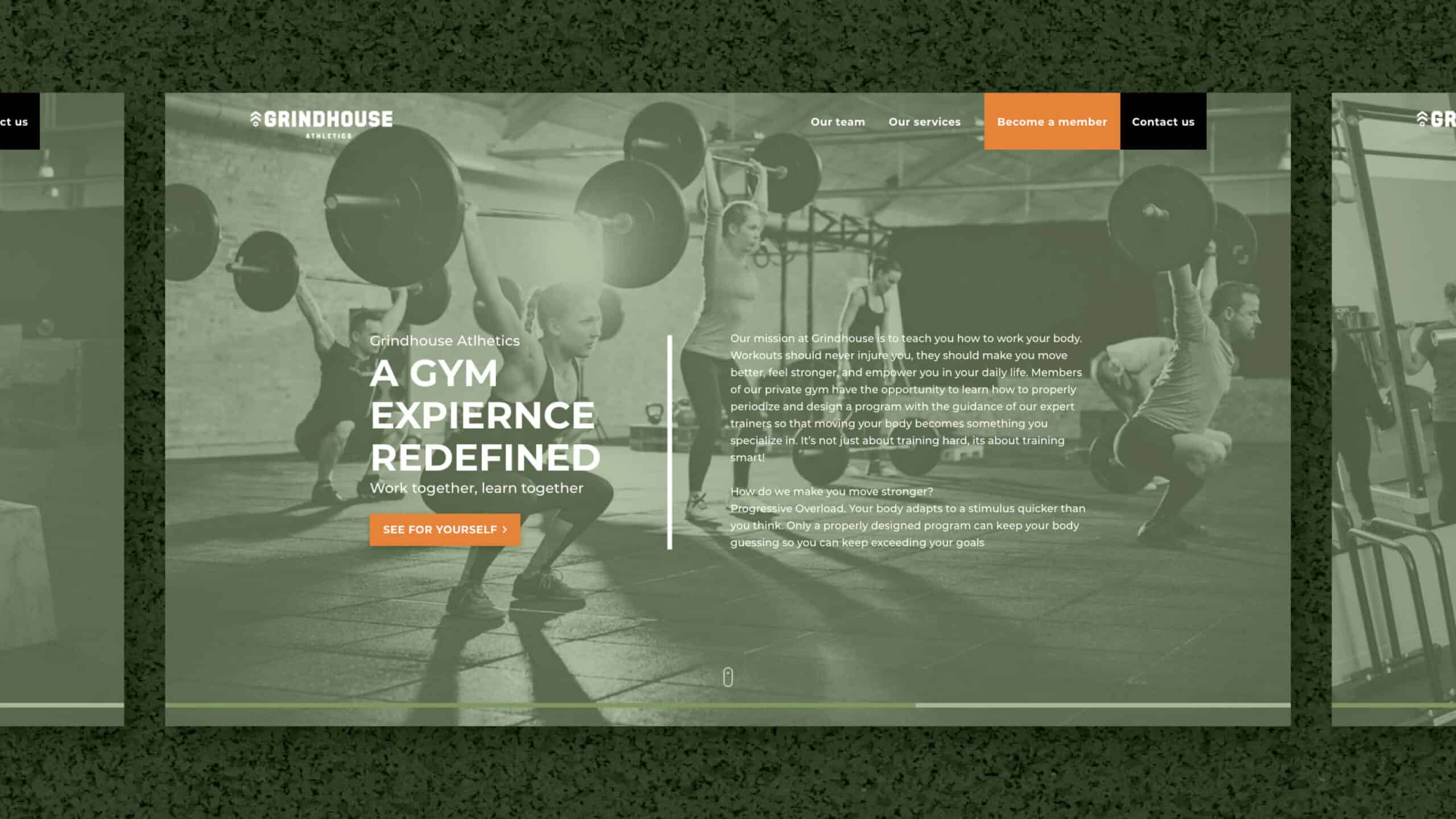
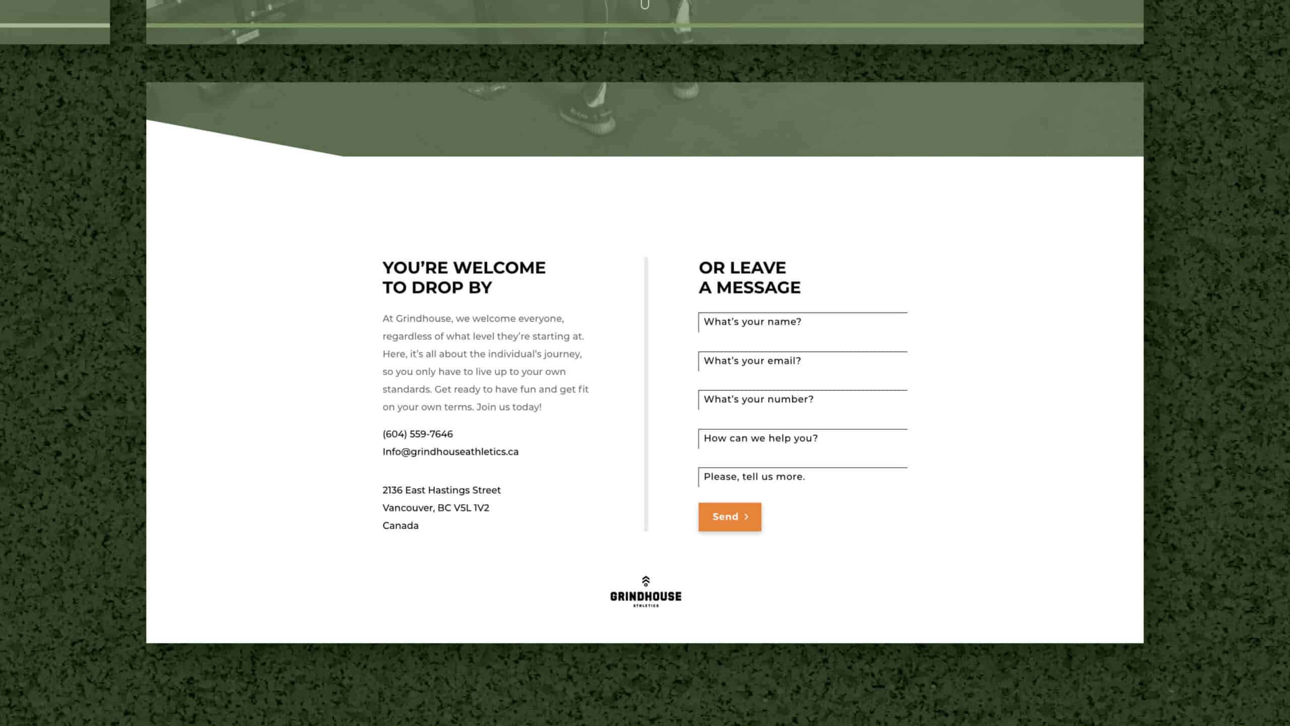
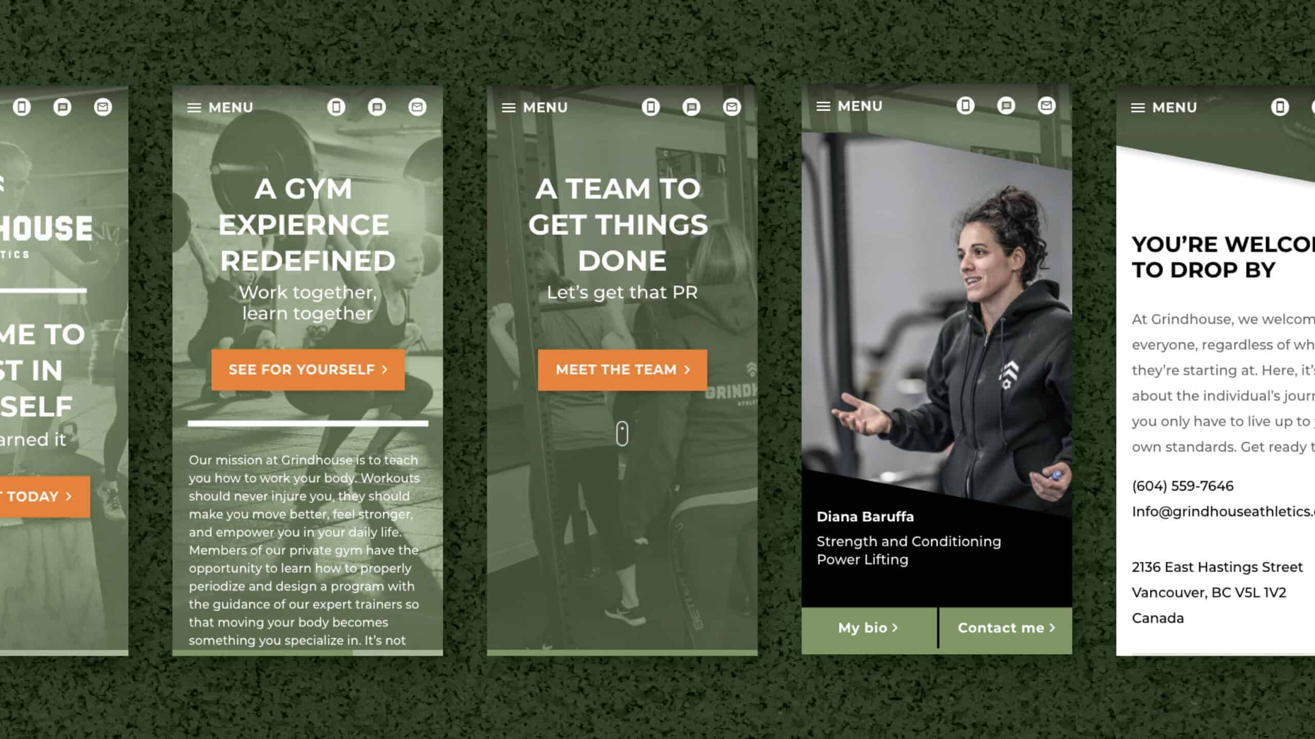
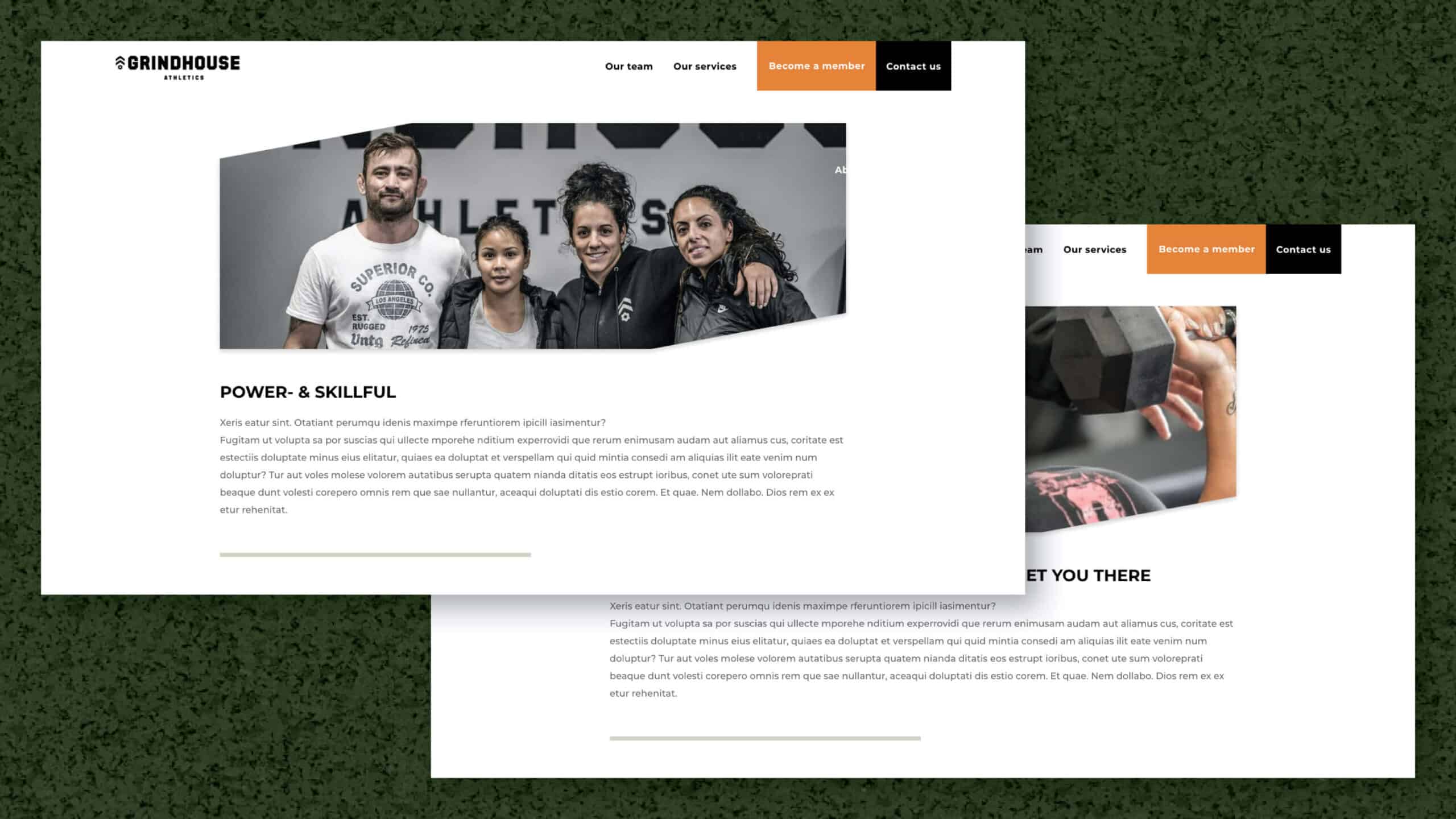
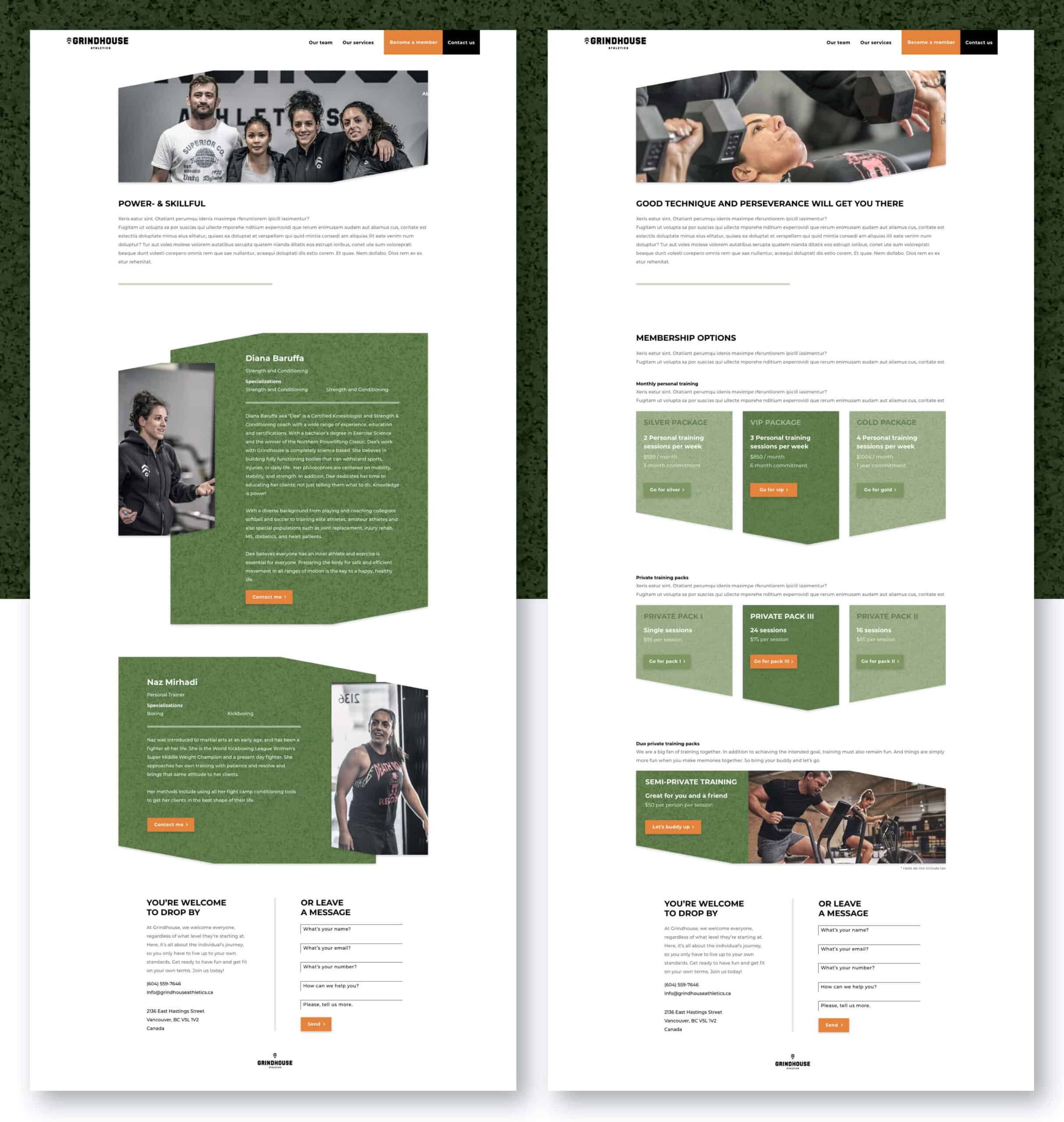
The next step was to translate this style into the website. The above ideas have been used in setting up the website. From hierarchy, user flow, wireframes, navigation and micro animations. Power and accessible have always been the hallmark.
In three scrolls or swipes you get to read the entire story of the duo and their gym, what they stand for and what they can do for you. Always accompanied by a clear navigation that does not lie about what it wants from you. To Experience Grindhouse Athletics for yourself. Because you are sold on the first step over the threshold. If you like sports, you like Grindhouse Athletics.