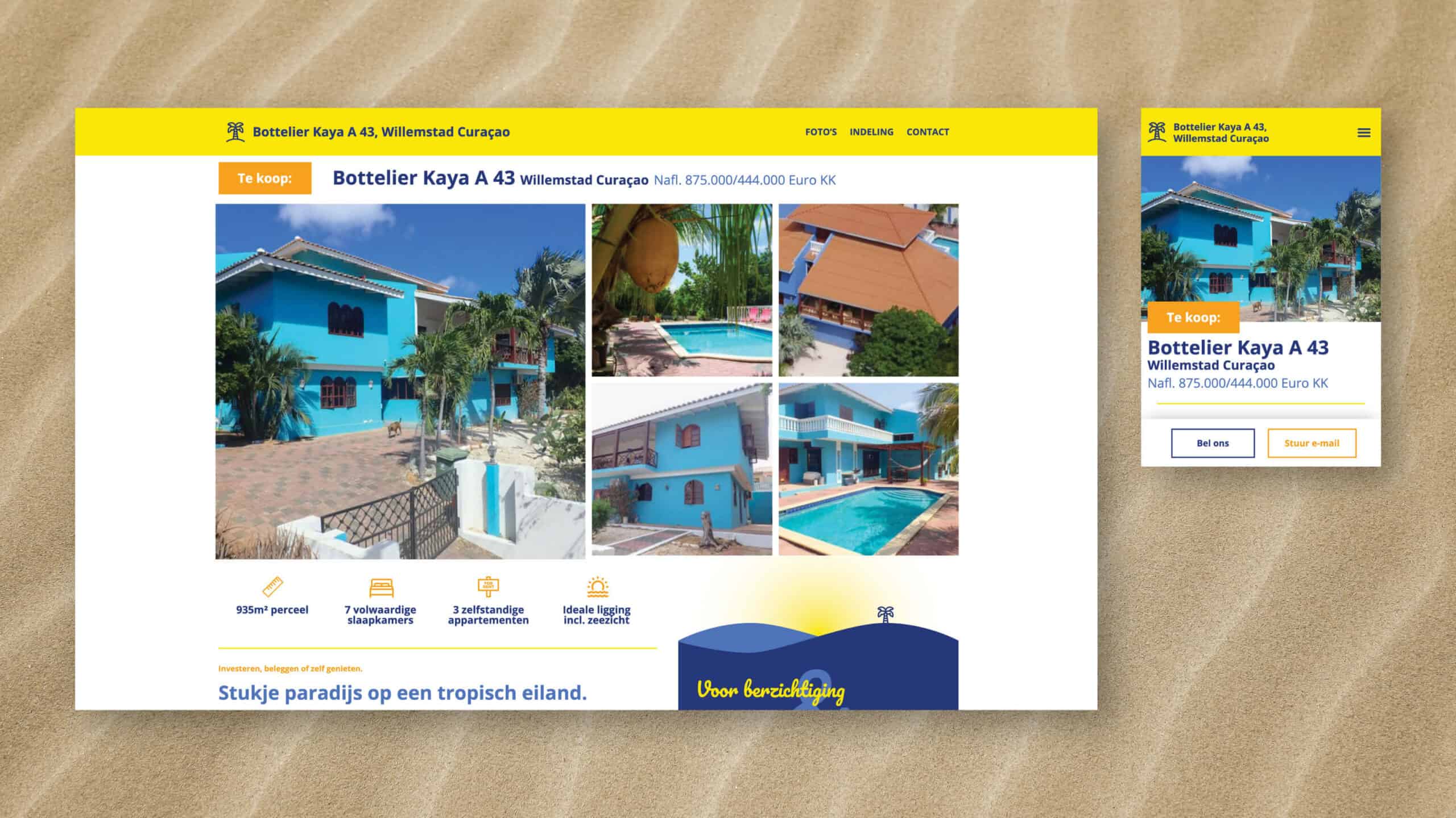
The home owners of Bottelier Kaya A 43 had their house for sale. The current sales channels did not do justice to this characteristic house. In consultation with the owners of the house, the idea arose to design a website that combines the atmosphere of the island and that of the house in a functionally strong and clear web design.
During this project I enjoyed a lot of freedom so I could create a real
cohesion between functionality and design.
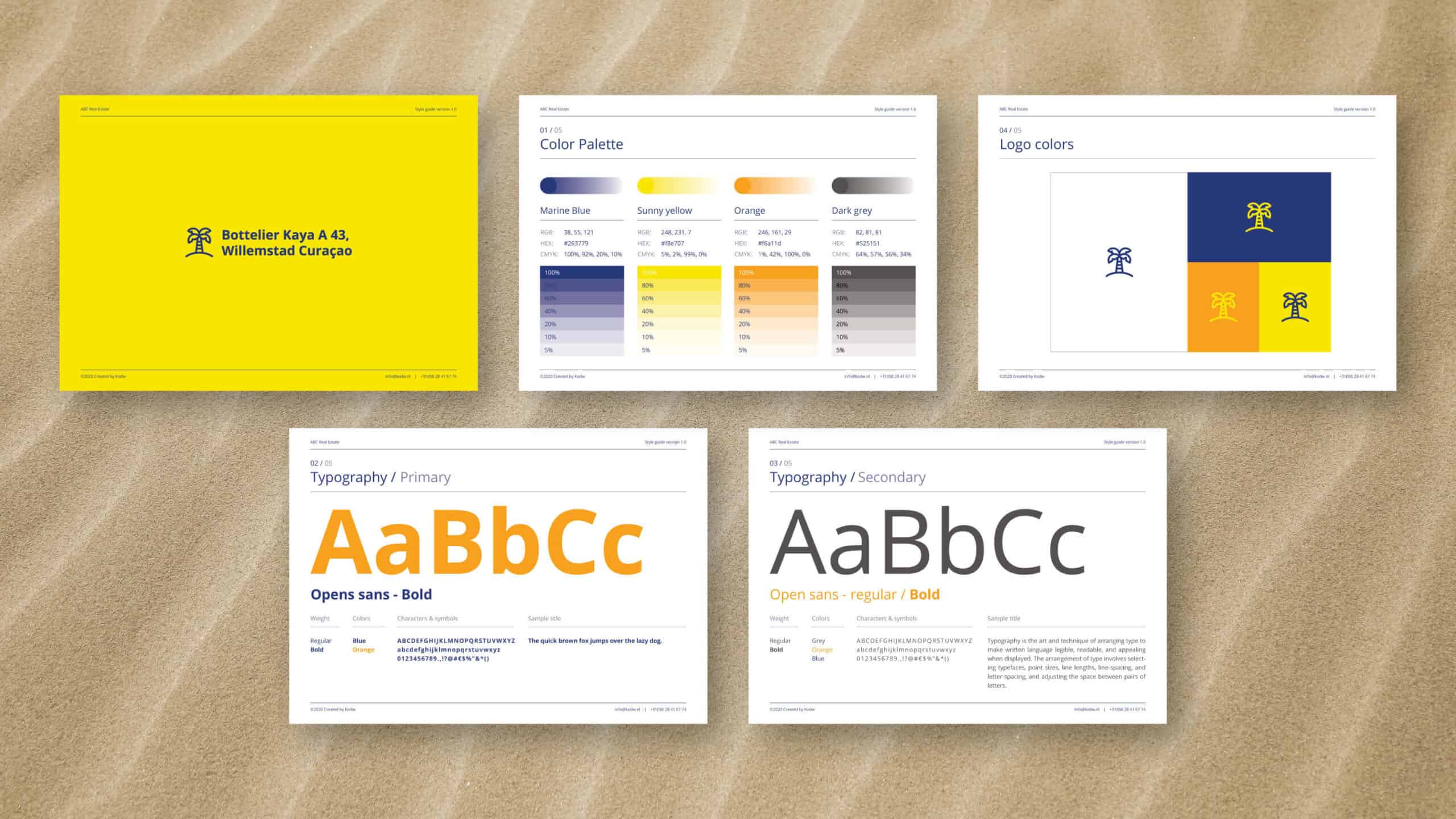
For the corporate identity, the choice was made to use the colors of Curaçao's flag as a guideline. The combination of a playful font with a good, strong and legible font ensures that the sunny and cheerful atmosphere of the island also was felt while reading. All without affecting the legibility.
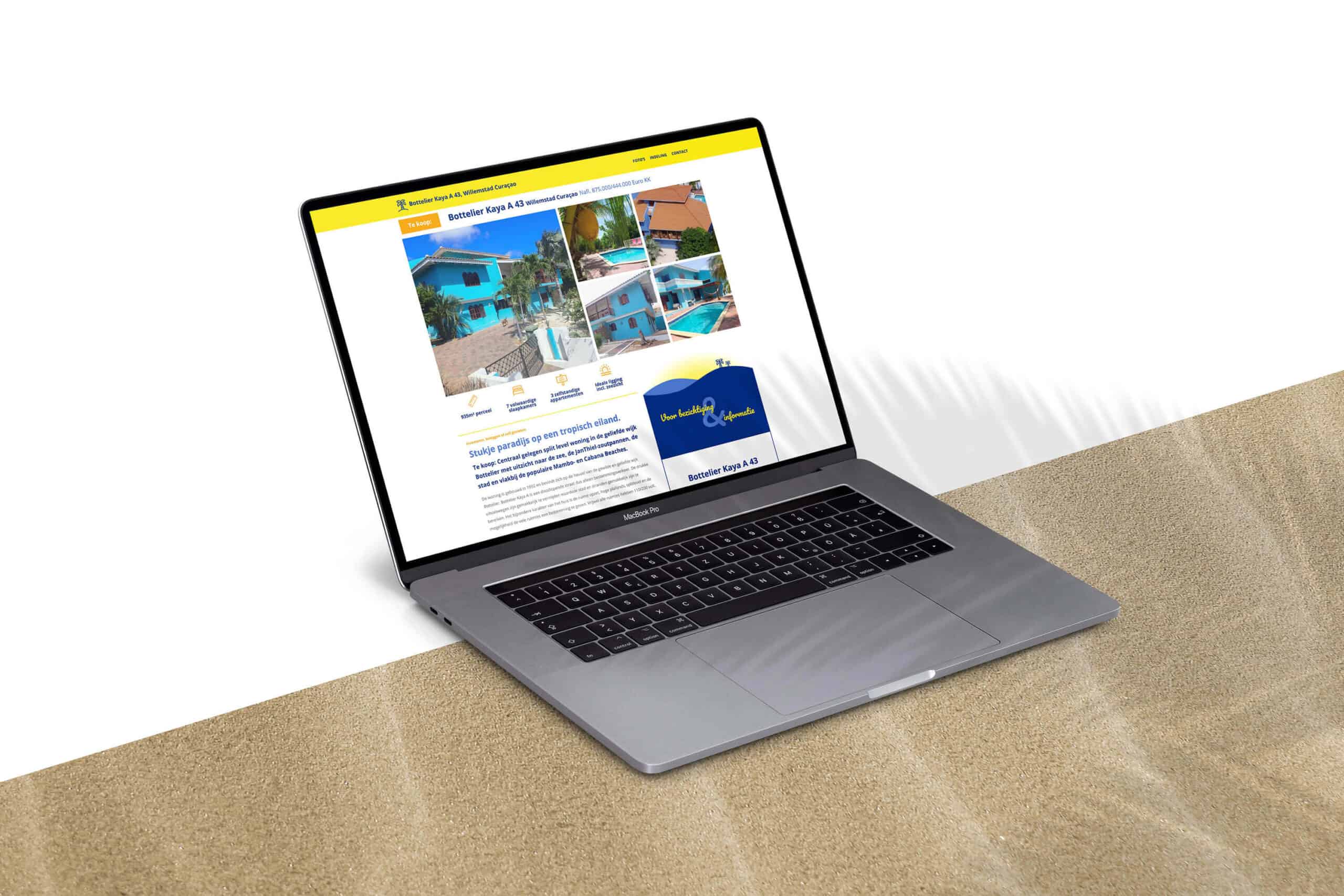
The homepage contains all the necessary information and should suffice. But to make sure people understand the architecture of the house, we decided to dedicate an extra page to a photo tour of the house and a page explaining the layout using floor plans.
Client TESTIMONIAL
I asked Koen if it was possible to make a presentation of our house we’re selling. Personally I was not impressed by the presentations of the houses made by brokers for their website.
Koen came with a very original en colorful web design showing our house in the right proportions. Because it’s a split level house it’s not easy to visualize the complexity of the structure. But, great job, every level is explained well with text, pictures and maps. With our new website launched and linked to the broker's website, we see an increasing amount of interest in our house. Lots of visitors but no buyers yet. Probably daydreamers dreaming living in such a house under the Caribbean sun!