Categories
Work

Kindvak.nl redesign

Case study

Kindvak.nl redesign

My role

UX/UI
Wordpress development

Client

Decoriginals

Year

2020 / 2021

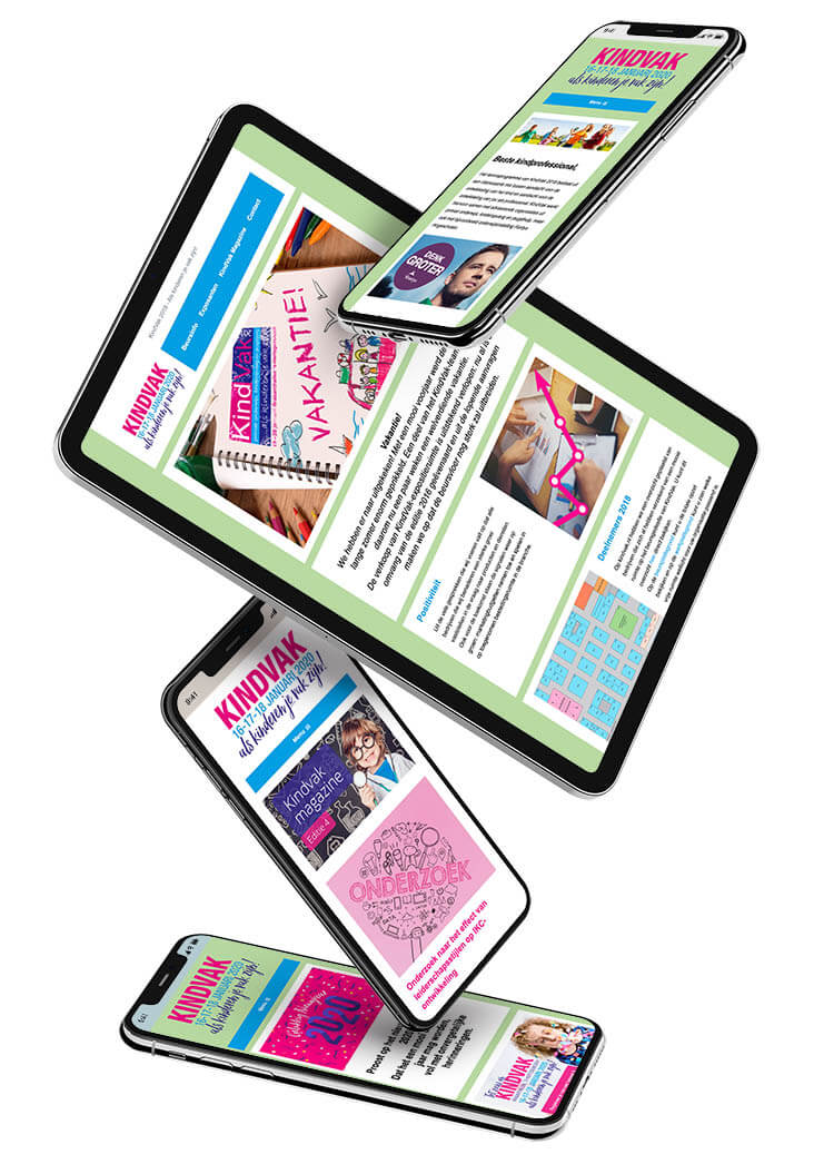
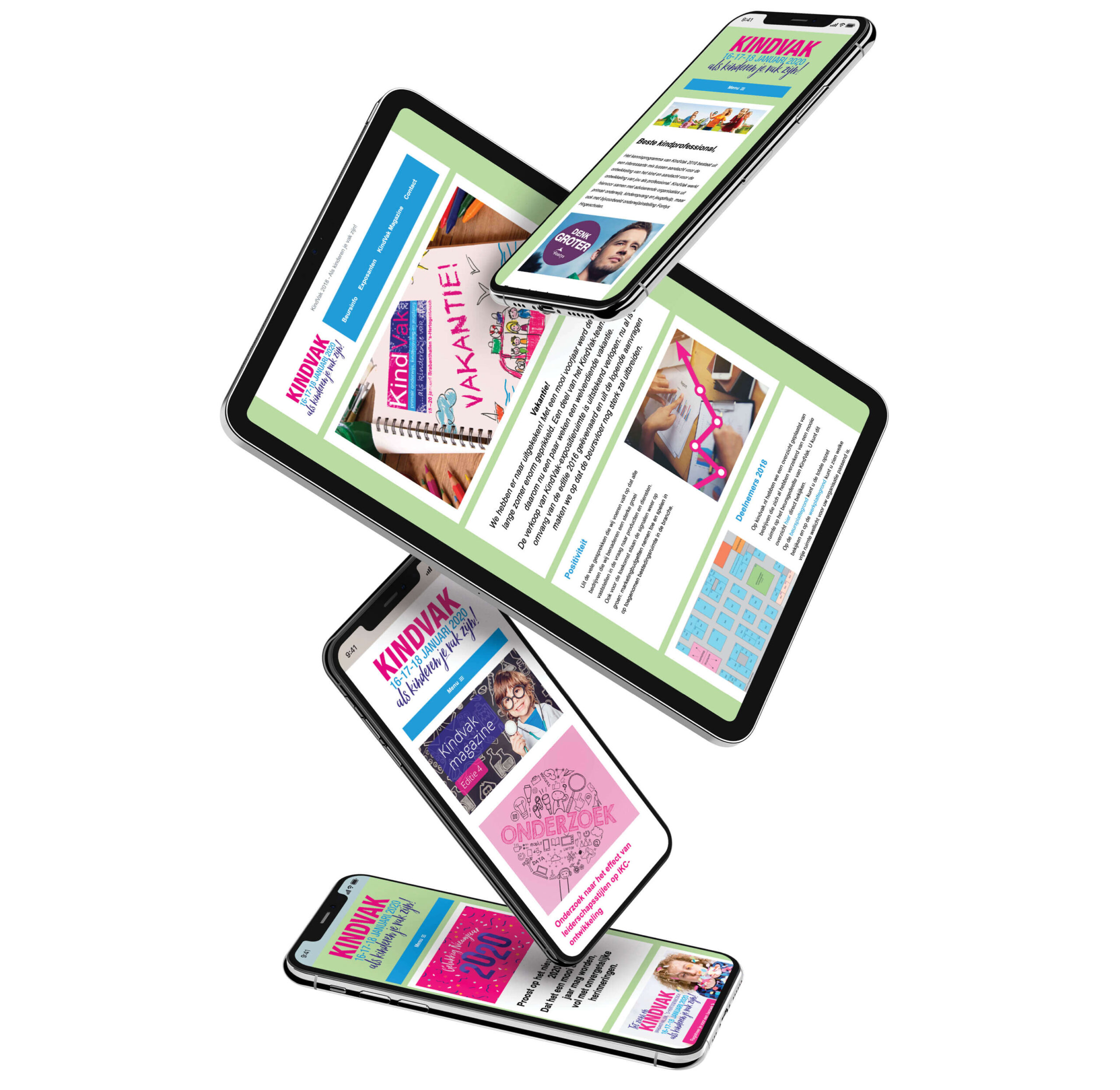
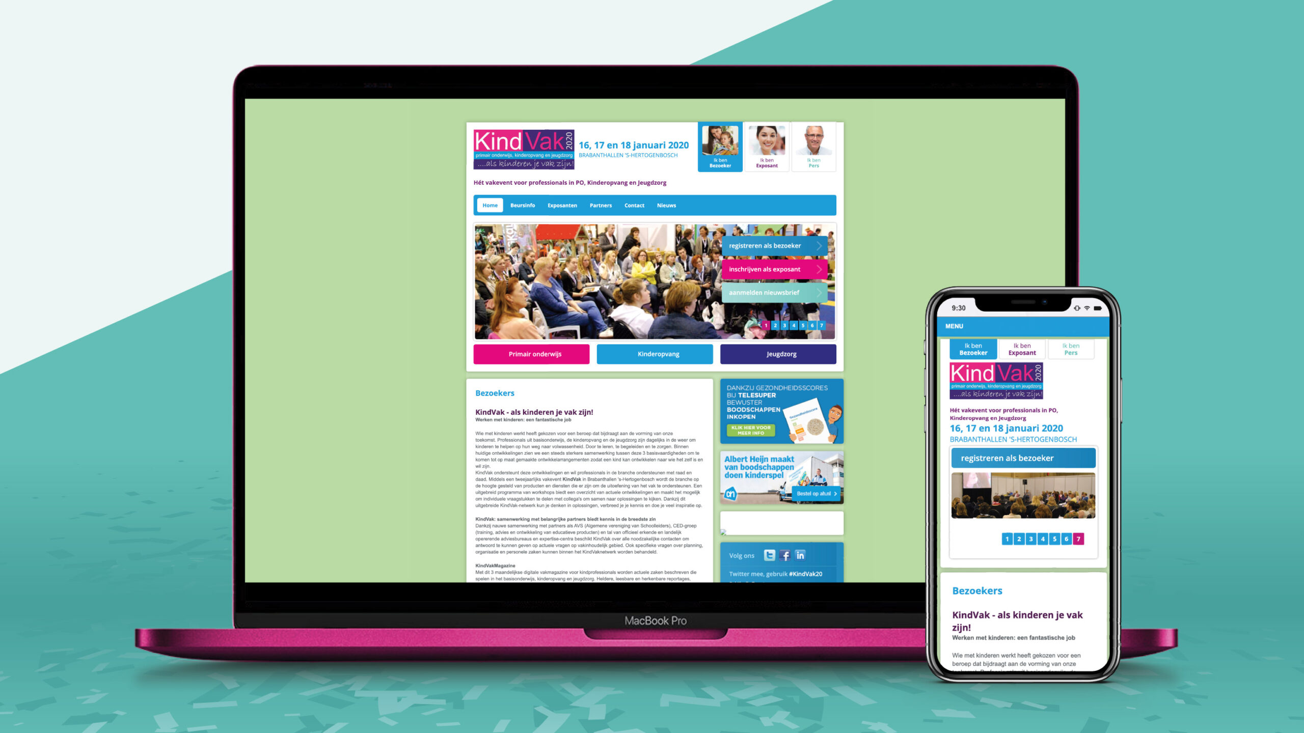
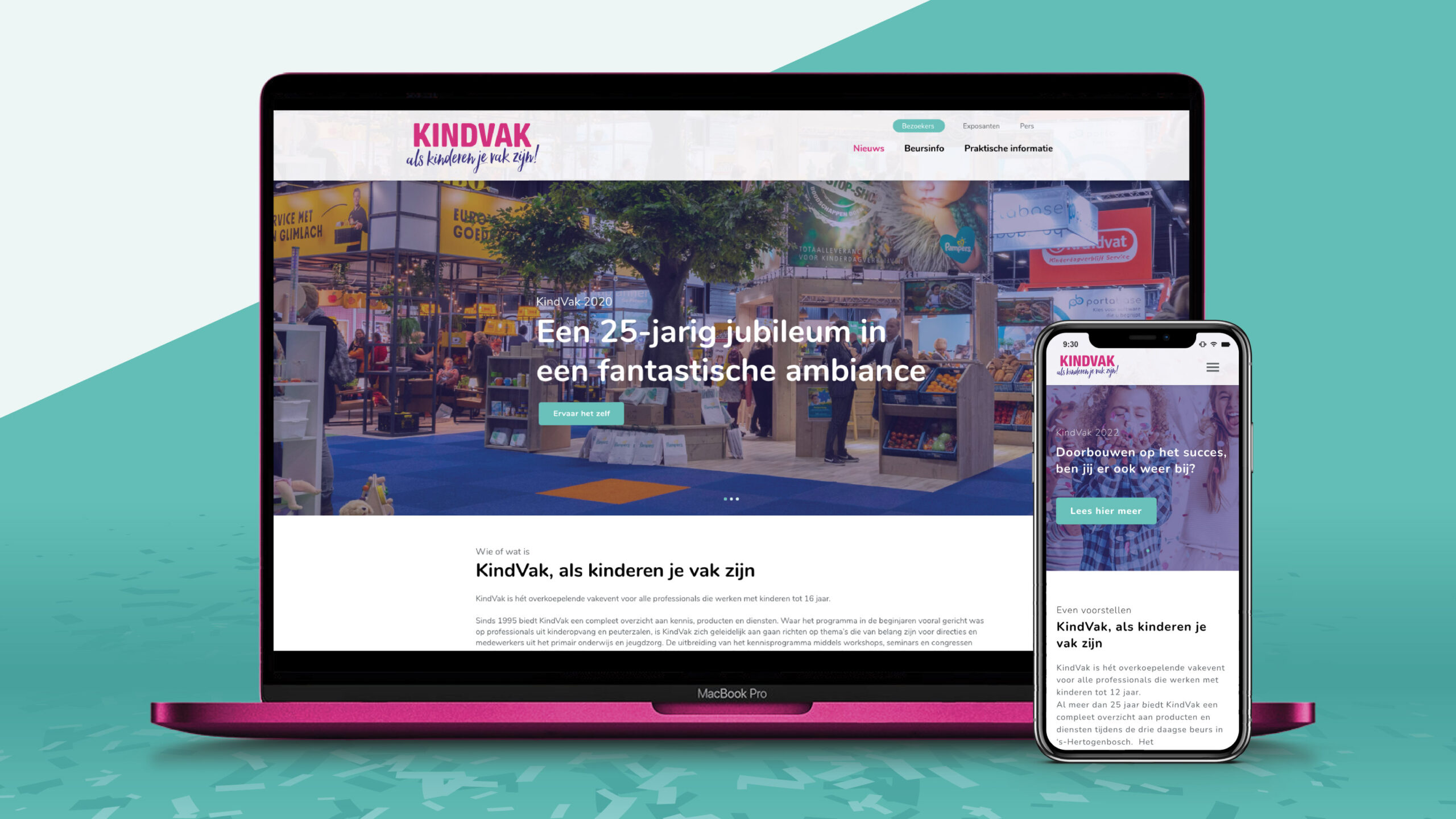
KindVak website has been in use for a very long time and has contributed too a lot of goals that KindVak set over the years. In 2020 it was decided that the website could be improved. They ran into limitations in design, marketing and the CMS was seriously outdated.

Together we embarked on the process of redesigning KindVak online. This based on the existing content. To do this, we went through five phases so that the new website made use of all that was still relevant from the old website and to arrive at a website that is completely up to date and stands on a strong foundation. The ease of use for the visitor as well as for the backend user was paramount.

The phases completed for this project:

  1. Hierarchy
  2. Wireframe (low fidelity)
  3. Corporate identity
  4. Prototype (high fidelity)
  5. WordPress development

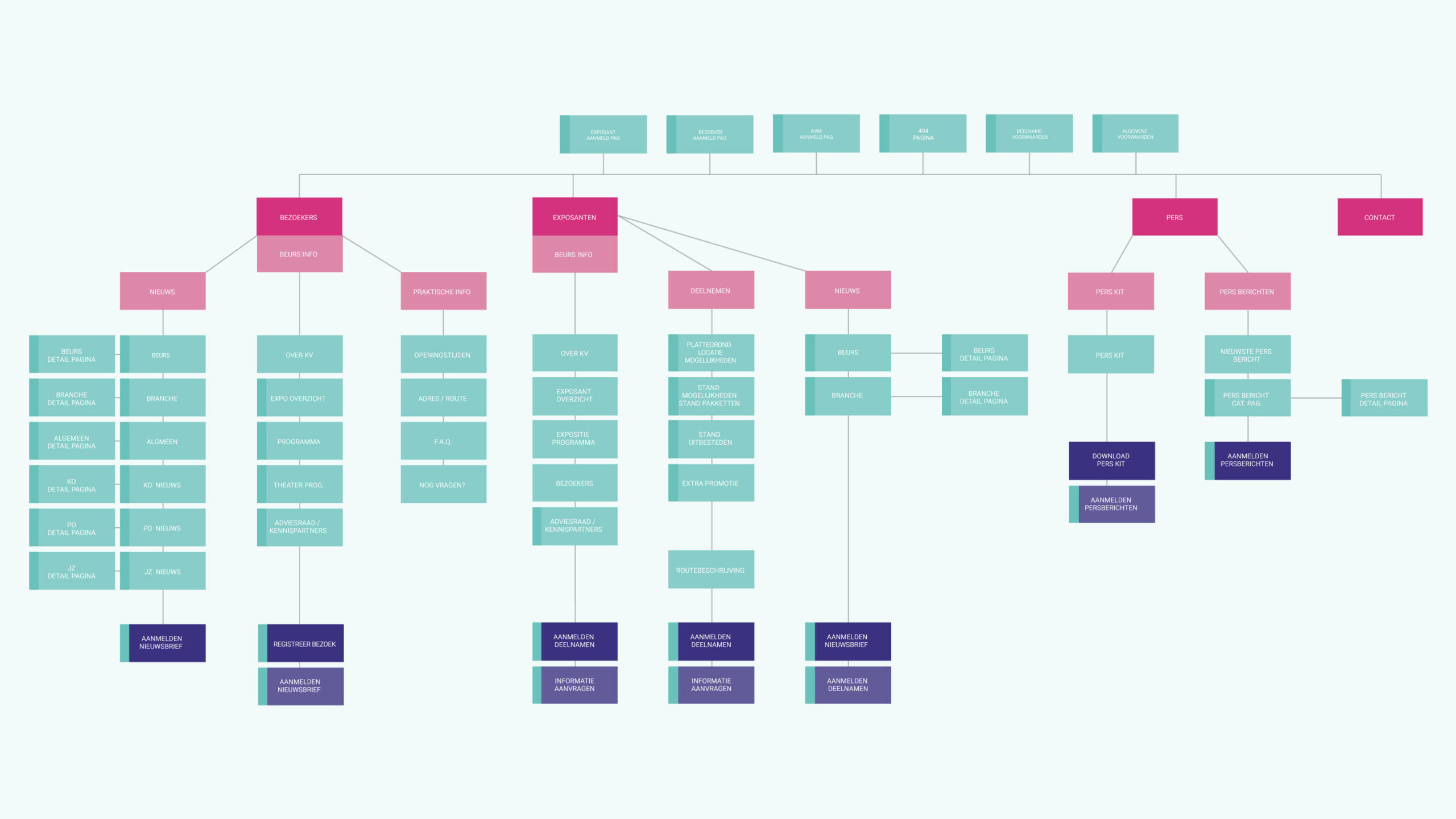
1. Hierarchy

At this stage, the original website was dissected. What was the hierarchy? What can we still use in an improved version and what should we leave behind? In addition, this phase gave a great opportunity to look at the content and whether this was still useable. Which resulted in an improved information architecture.
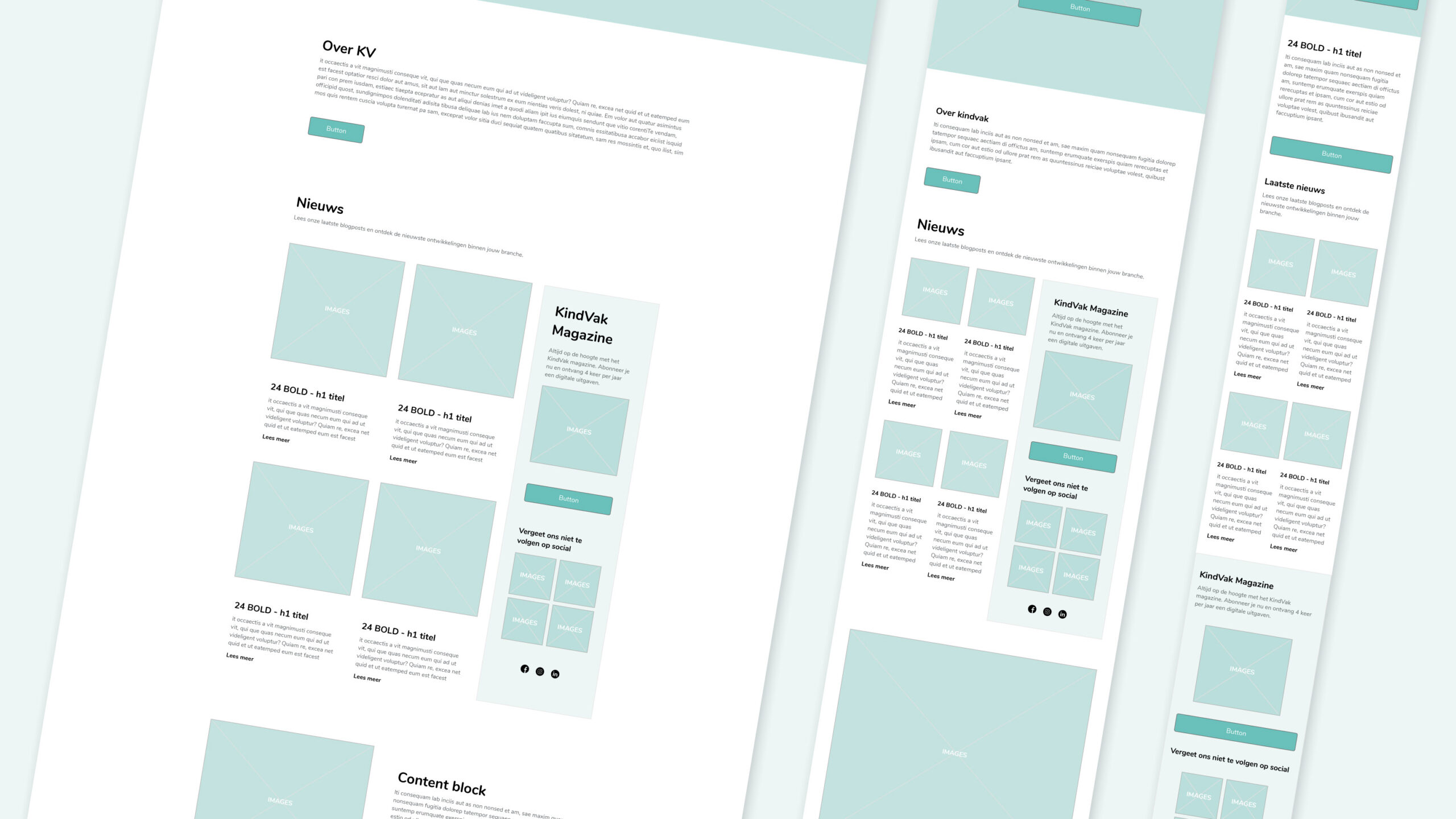
2. Wireframe (low fidelity)

After the renewed hierarchy and content layout was approved, it was time to create the wireframes to get a better feel for the use of content at page level. In this phase we really looked at the traffic and behaviour on the old site and used this to our advantage.
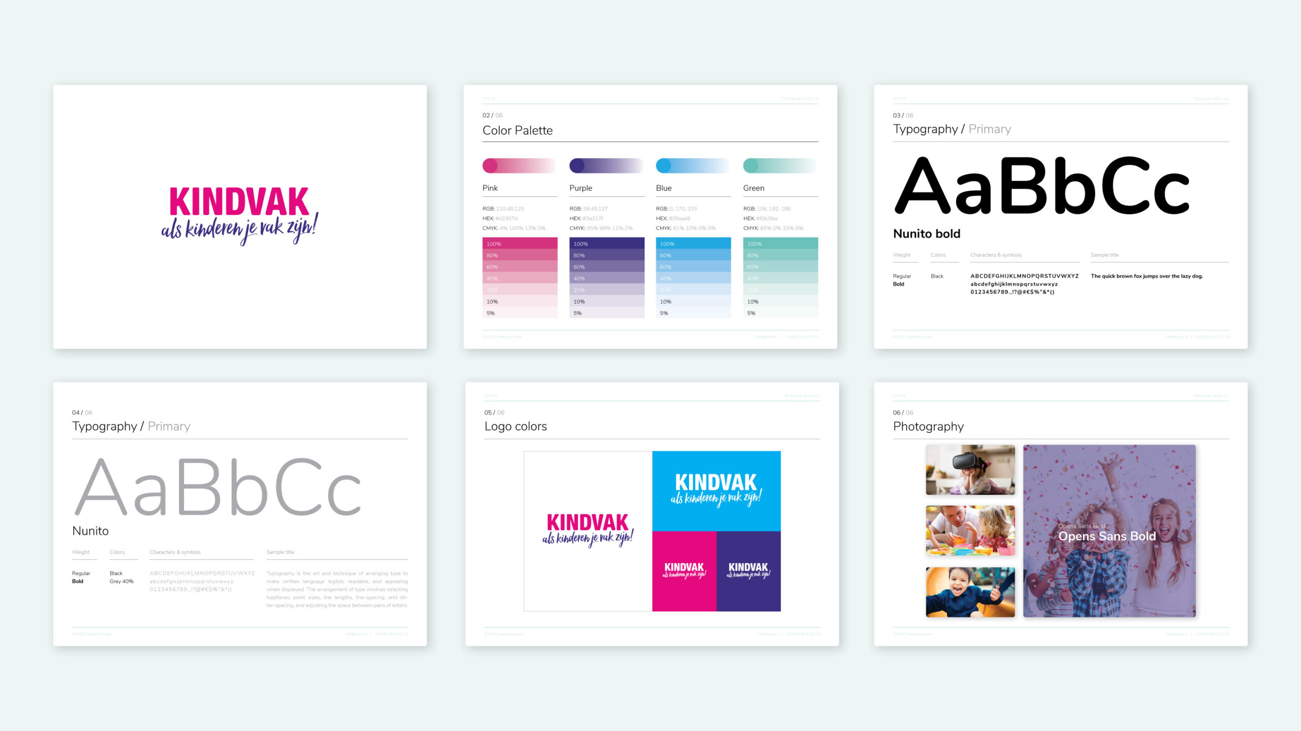
3. Corporate identity

The client had some doubts if the corporate identity could still represent KindVak with all of her new ambitions. KODW reinvented the corporate identity so it would give KindVak the new and improved feeling but never let it lose the recognizability it has built up in the last 25 years.
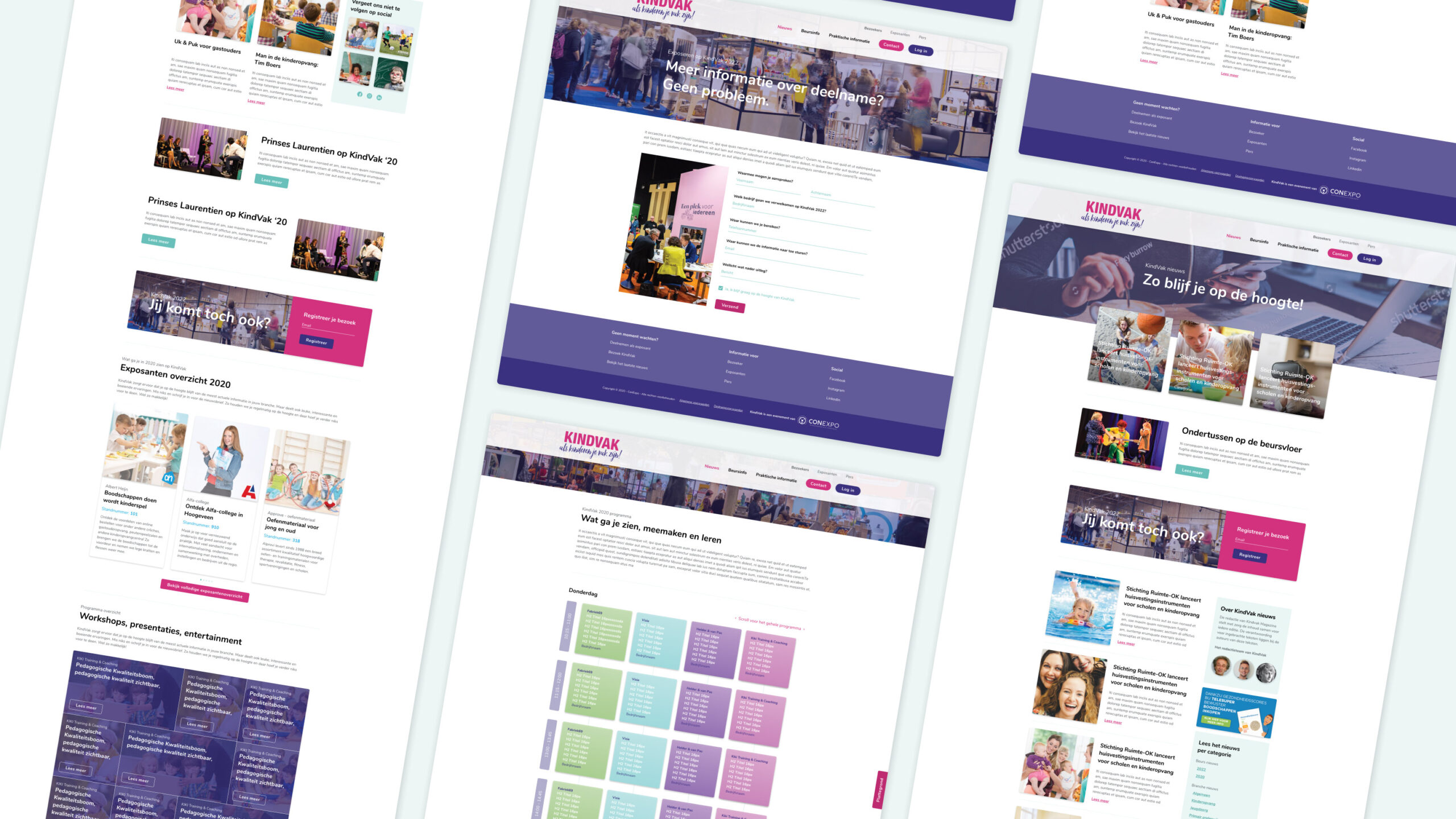
4. Prototype (high fidelity)

Now we had arrived at the stage where everything came together. The new layout of the pages based on the new elements, enriched with a better use of the corporate identity.

The whole thing also came to life because interaction of sliders, buttons, forms, micro animations etc. was included in the prototype. This always gives a much more real feeling of how the actual website will look and feel. 
5. WordPress development

In the final phase, the prototype was converted to a wordpress website. In this phase, the greatest priority was to organise the various information flows in the backend in a way the editorial team benefited from its efficiency.
Client TESTIMONIAL

For the restyling of KindVak.nl I approached Koen from KODW. He had been involved in the maintenance of the old site for some time, so he knew the site like no other. In addition, as a small company, I prefer to work with fellow SMEs rather than large (unwieldy) organizations.

And I did not regret it for a second. After the initial briefing and planning, Koen got to work and his first set-up was an immediate hit. The agreement was that we would fill a lot of the content ourselves. Since my experience with WordPress was limited, I also called and emailed Koen a lot during this part of the process, but no question was too crazy for Koen.

What I also really liked was his clear communication about what was and what was not included in the agreement. This resulted in no surprises afterwards.

Our wish was a fresh, easy to navigate site to which we can simply add pages and content. The set-up on the backend had to be simple enough so that an intern can also use it. We certainly achieved that result. And may I add, within time and budget. KindVak is up to date and ready for a fresh start. This turned out to be a great collaboration!

Gerbrig Reitsma

Organizer / exhibition manager KindVak - ConExpo
Thanks for watching

Hope you enjoyed it

Categories
Work

Grindhouse Athletics

Case study

Grindhouse Athletics

My role

UI design
Website Design

Client

Grindhouse Athletics

Year

2020

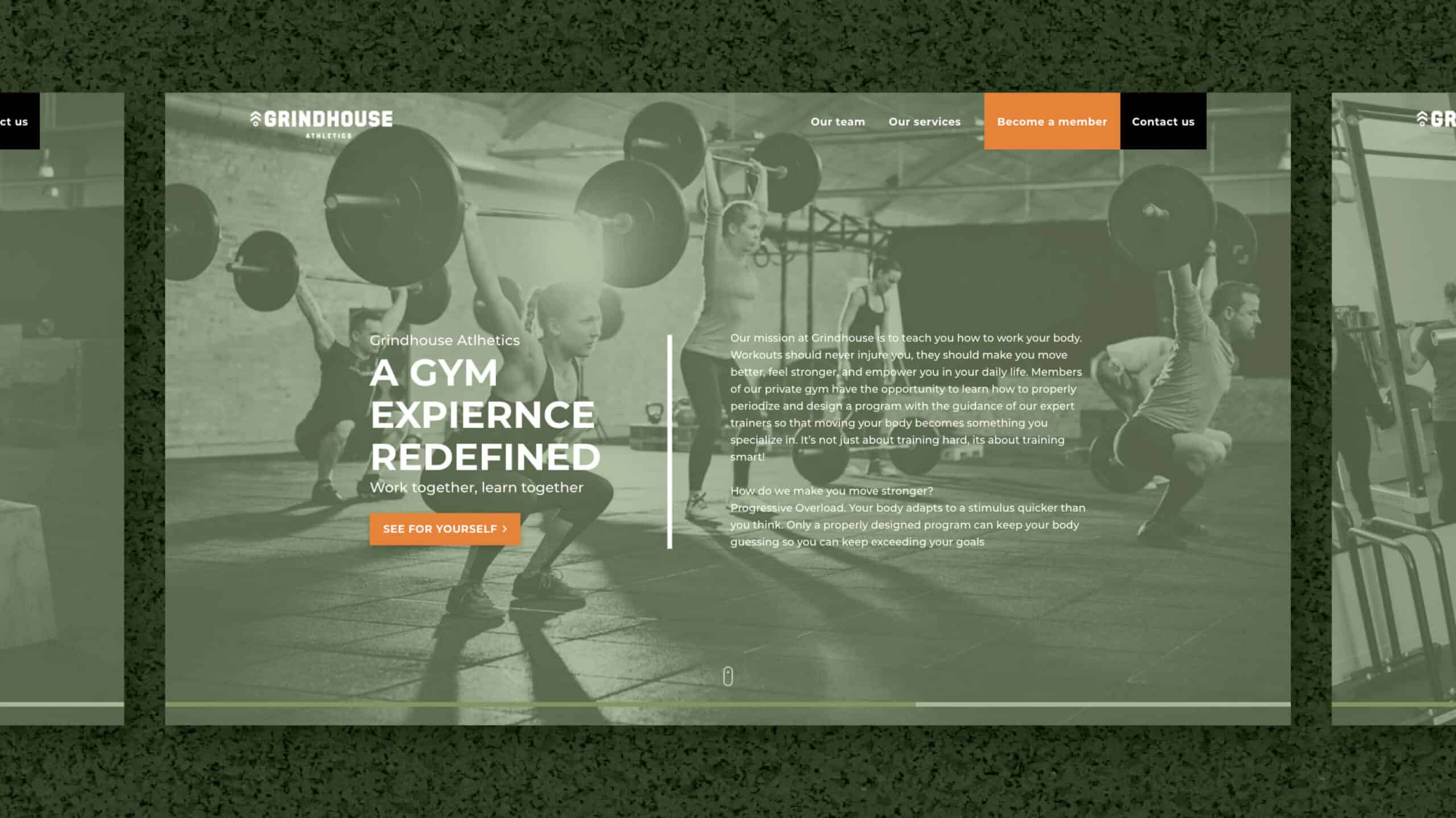
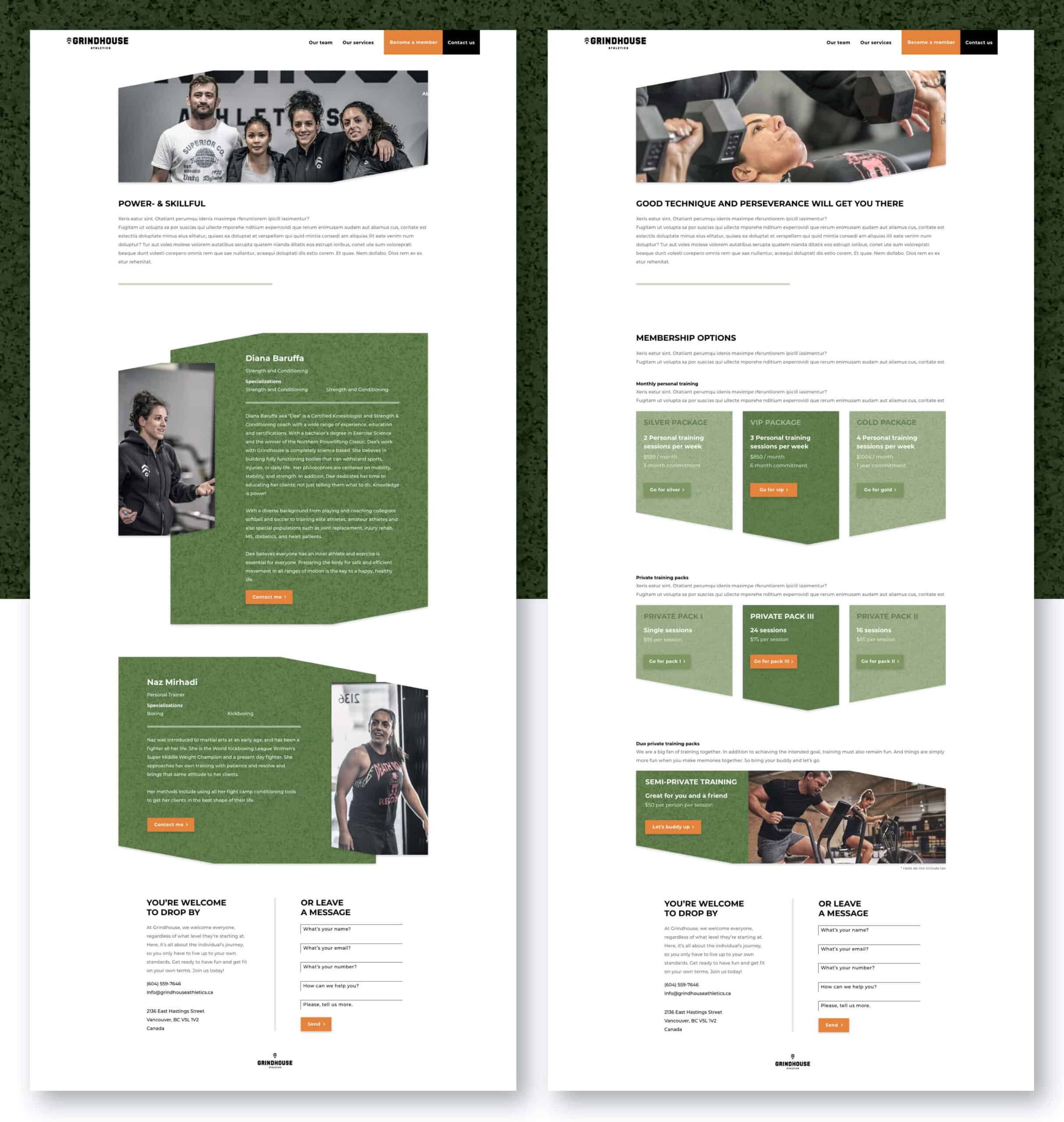
The sporty duo Diana and Naz from Canada have joined forces and founded Grindhouse Athletics. Locally, they had already generated a lot of brand awareness, among other things due to their sporting achievements. Now it was time for the next step. Their online presence.

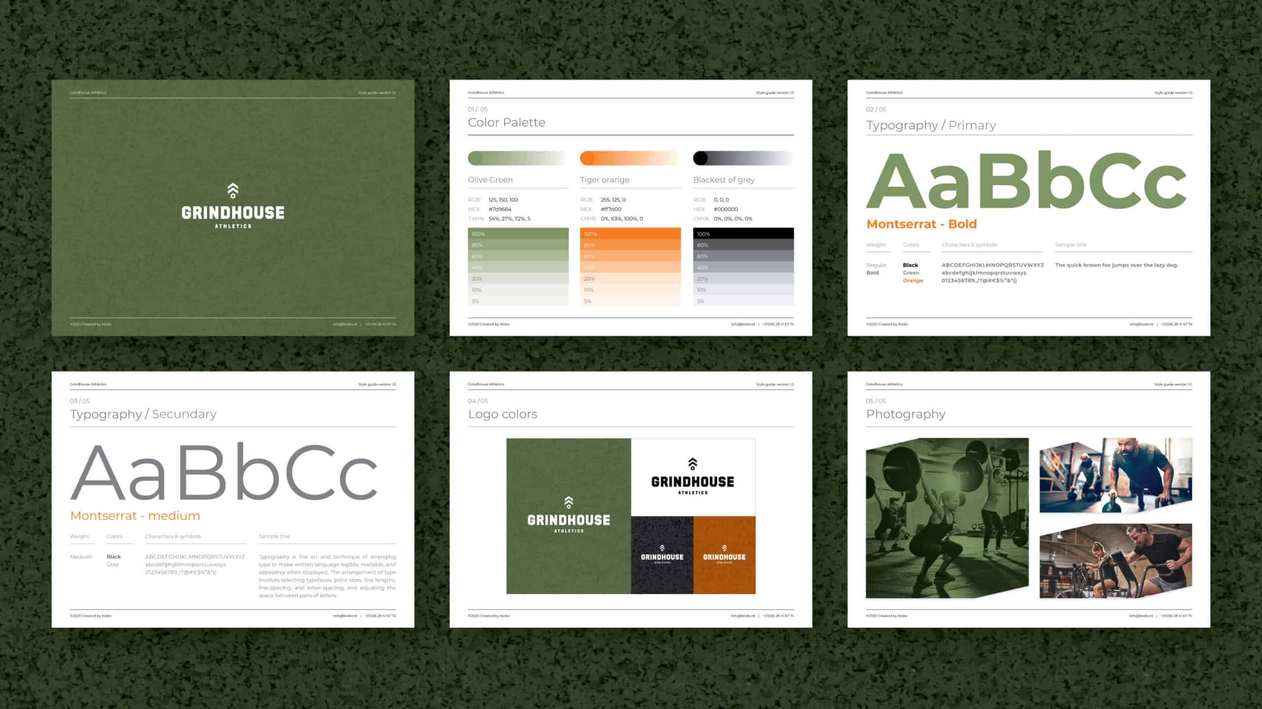
The first step was to develop an identity that felt good for both ladies. The wish was a powerful yet inviting appearance. By using a unique color combination, relatively fine font use, powerful photography and switching between coarse & fine graphic elements, a style has been created that visualizes the warm personalities of the trainers as well as embraces the energetic and purposeful ambitions of the gym.

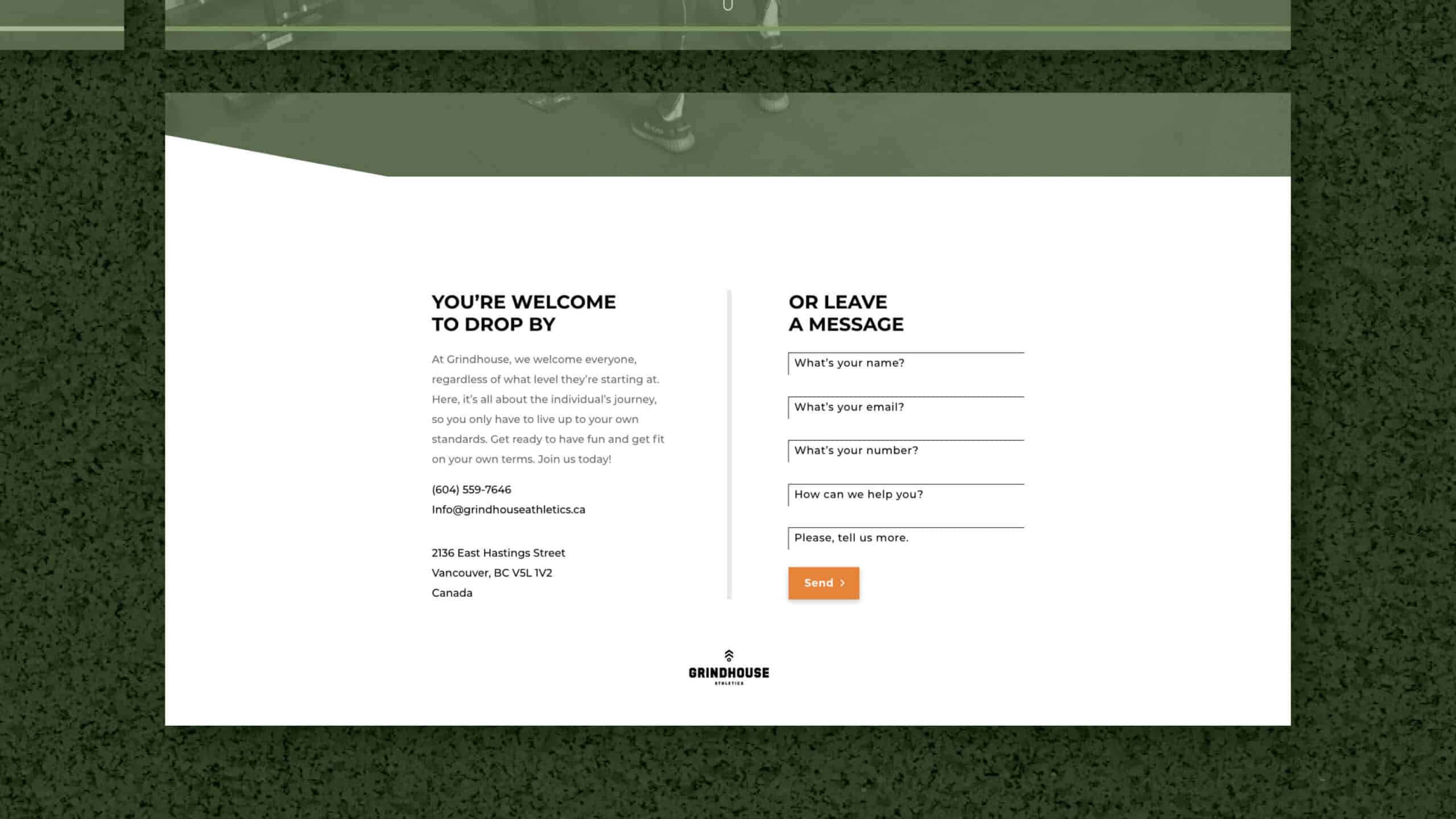
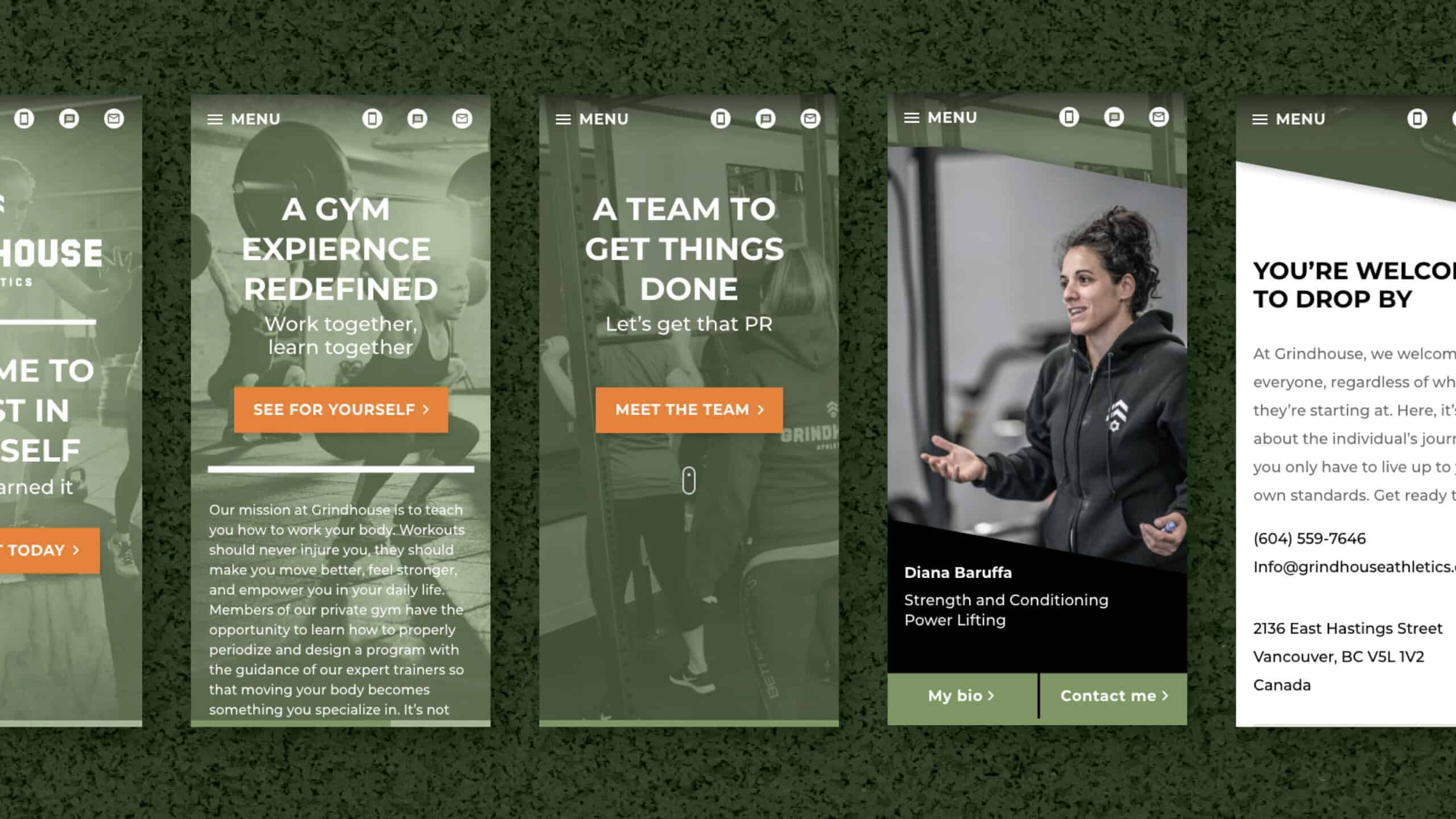
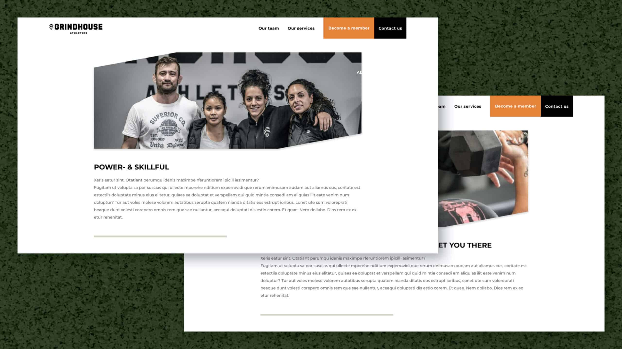
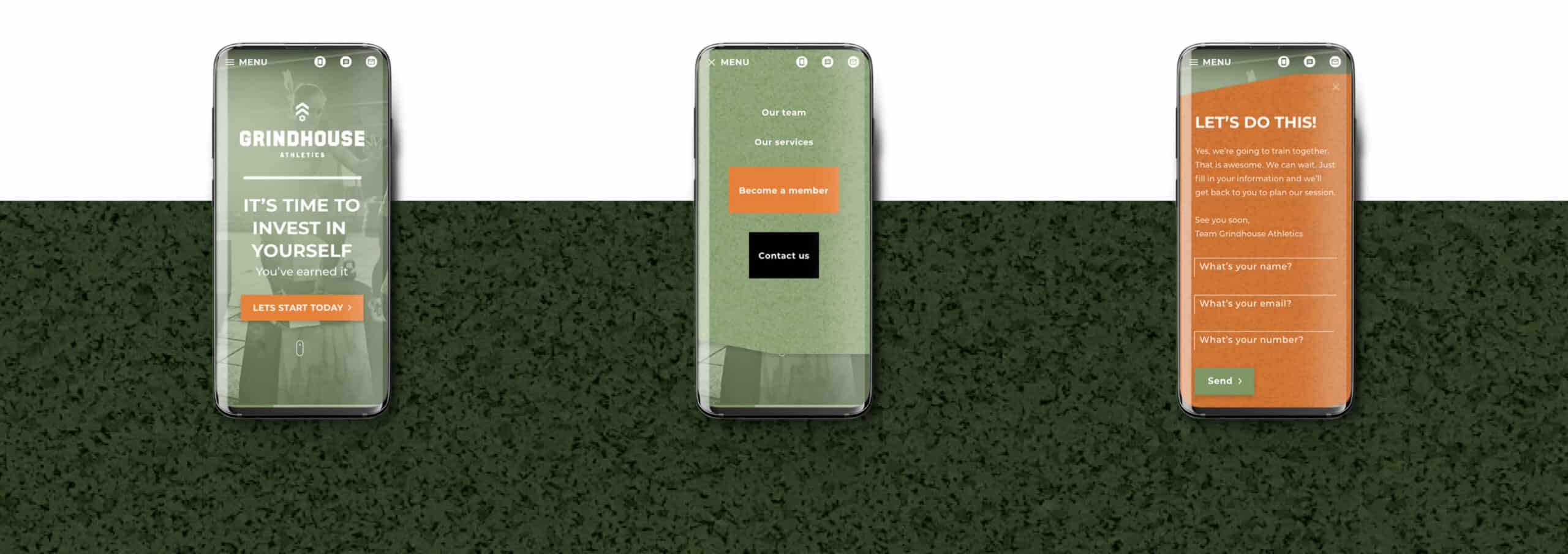
The next step was to translate this style into the website. The above ideas have been used in setting up the website. From hierarchy, user flow, wireframes, navigation and micro animations. Power and accessible have always been the hallmark.

In three scrolls or swipes you get to read the entire story of the duo and their gym, what they stand for and what they can do for you. Always accompanied by a clear navigation that does not lie about what it wants from you. To Experience Grindhouse Athletics for yourself. Because you are sold on the first step over the threshold. If you like sports, you like Grindhouse Athletics.

Thanks for watching

Hope you enjoyed it

Categories
Work

Kindvak magazine

Case study

Kindvak magazine

My role

Graphic design
Marketing

Client

Conexpo
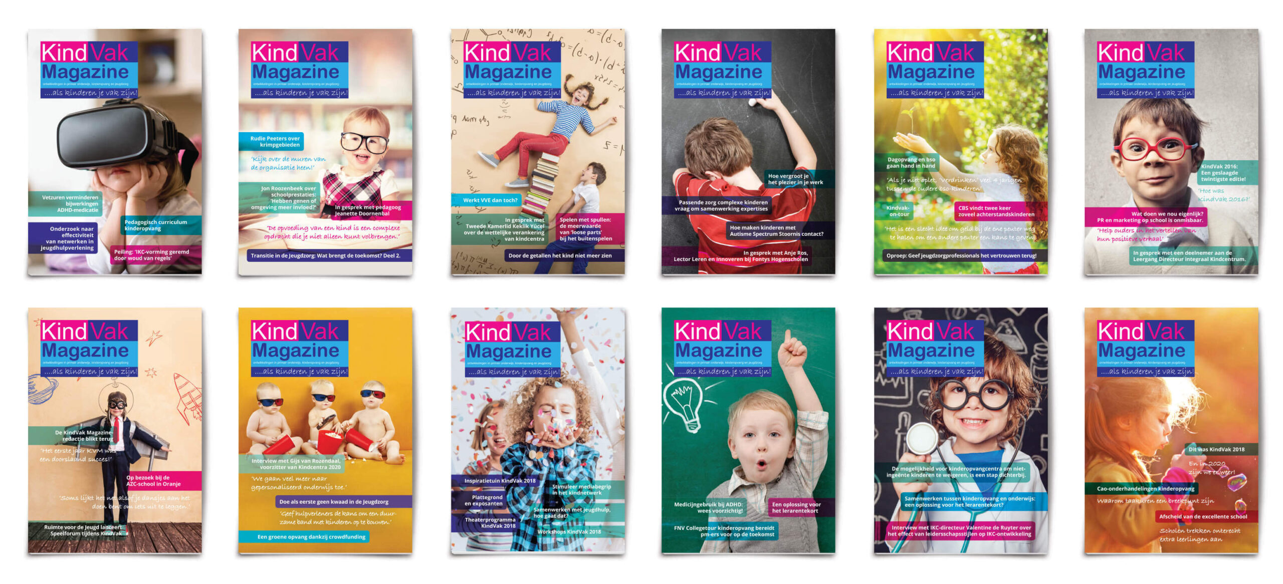
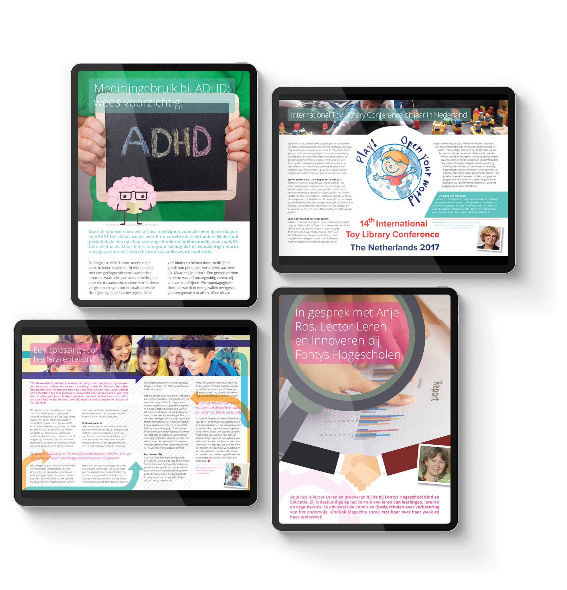
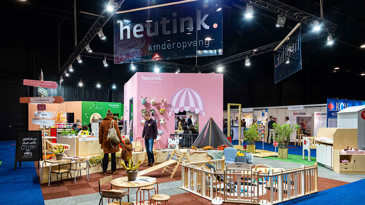
Since 1995, Kindvak is a biennial event that is held to bring together all professionals in the childcare, youth care and primary education sectors. In this way, KindVak has been the meeting point for the supply and demand of knowledge, services and materials for professionals who work with children.
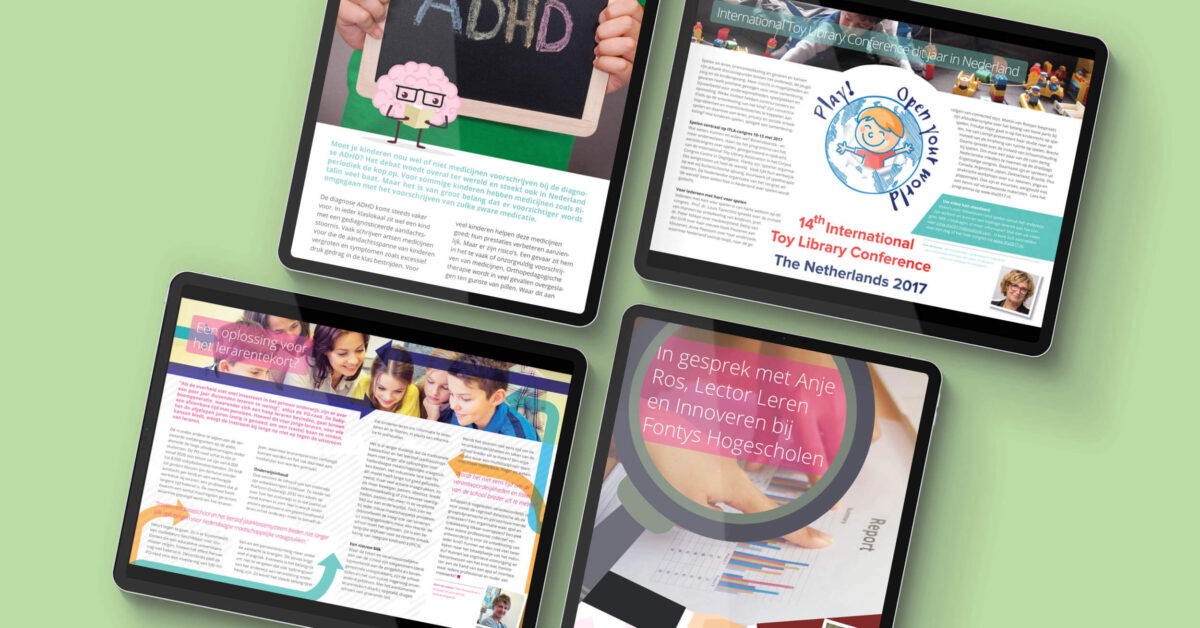
In order to remain up to date for the professionals in addition to the biennial event, an online approach was chosen to create a platform to share knowledge, services, materials and current news.

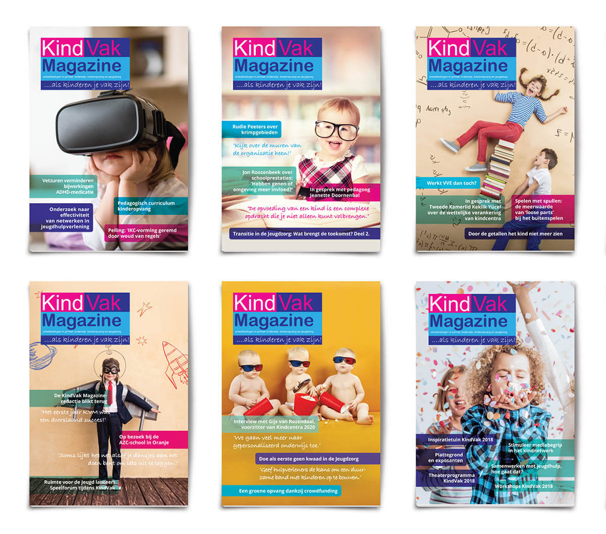
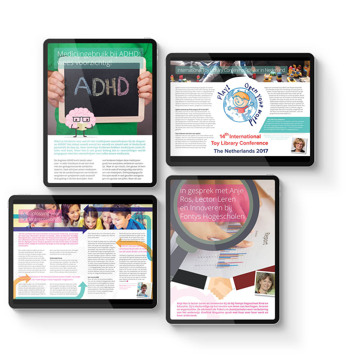
This strategy was kicked off with the realization of a digital magazine that is published 6 times a year. Each release is distributed and brought to the attention through the use of social media, email and content marketing.

I had the honor of producing the first 20 editions of this magazine and contributing to a wider audience of readers using the aforementioned marketing strategies. In this way, as a team of six, we managed to approach and captivate a large group of people and we have continued to do this to this day.

Thanks for watching

Hope you enjoyed it

Categories
Work

Rainbowtopia

Case study

Rainbowtopia

My role

Graphic design

Client

IKC Binnenstebuiten

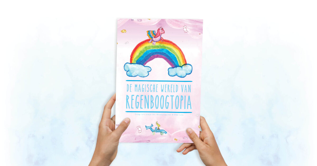
The collaboration came from a spontaneous idea between Ellen Lina, writer, Diane Moll, teacher IKC Binnenstebuiten.

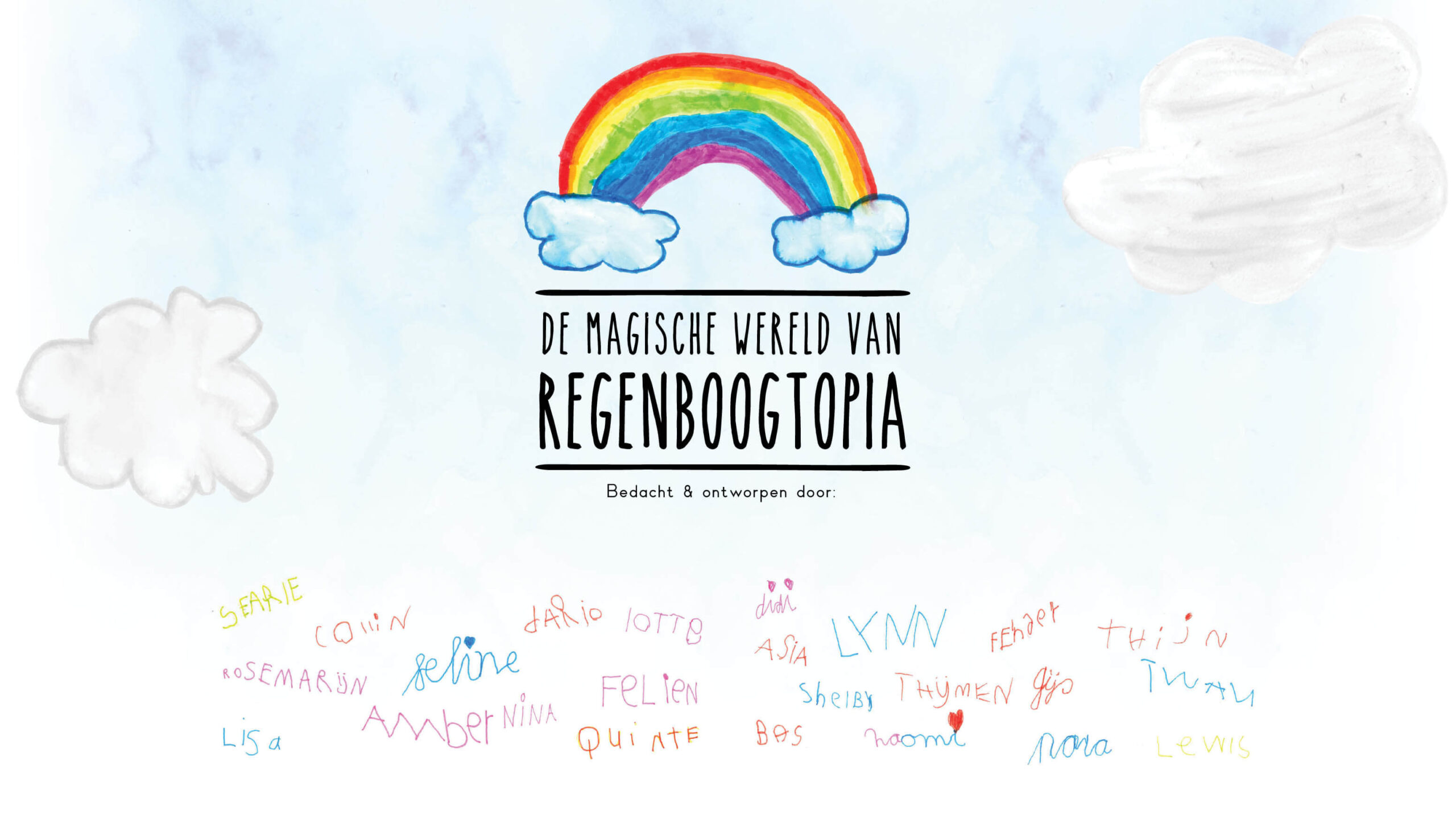
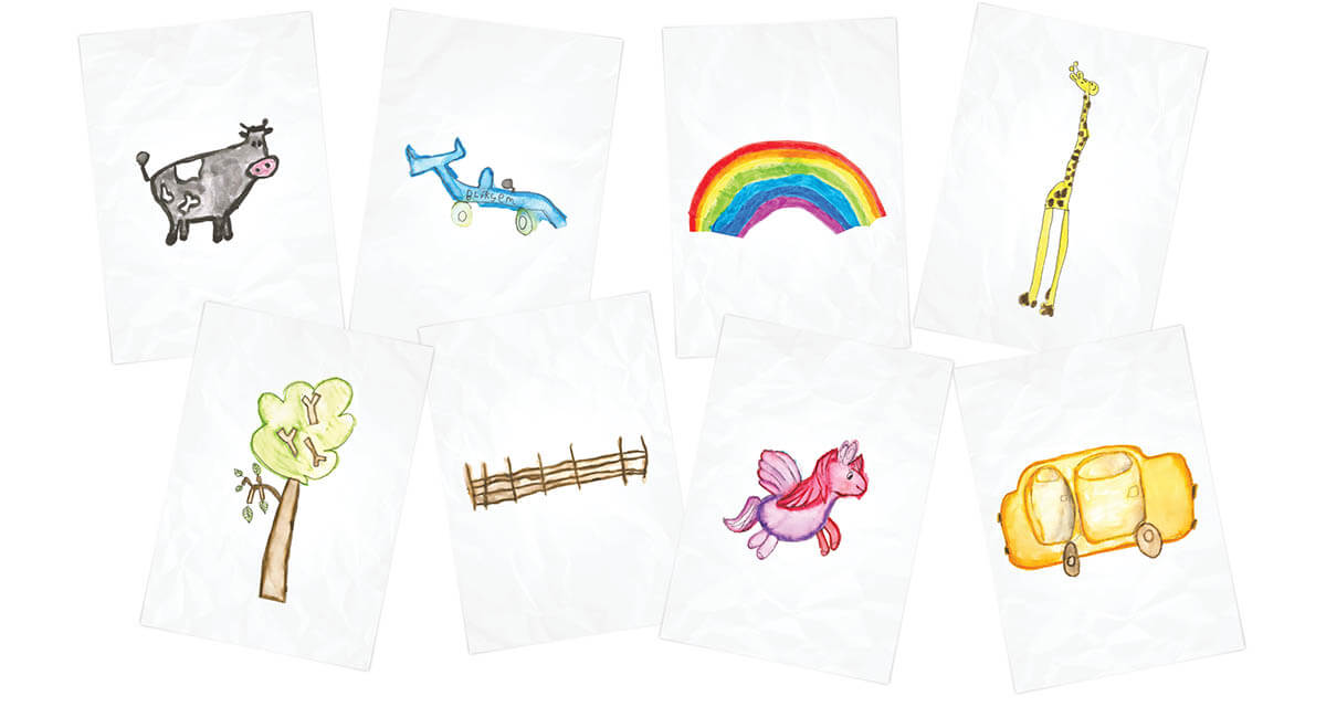
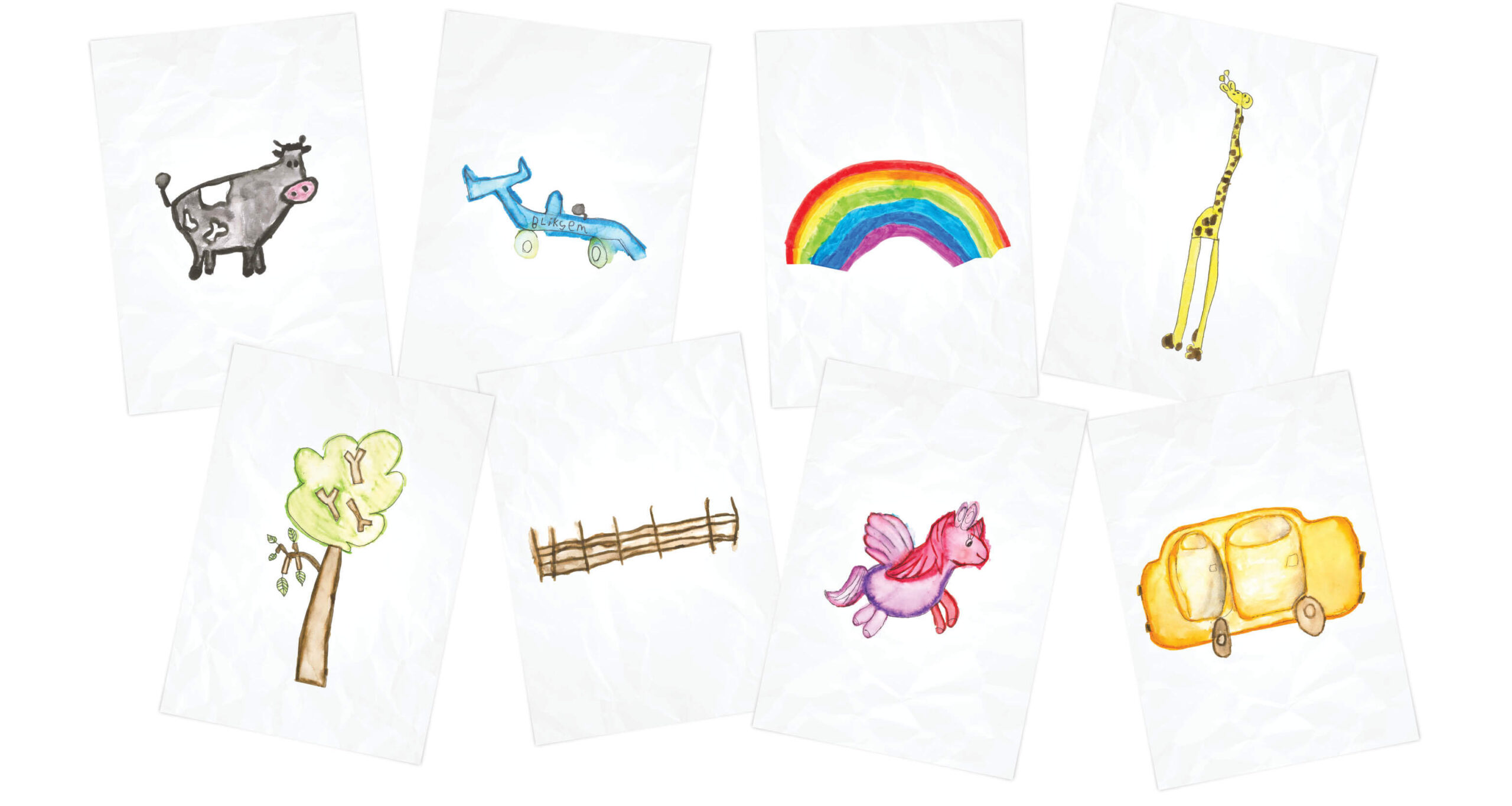
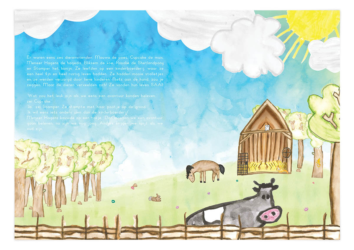
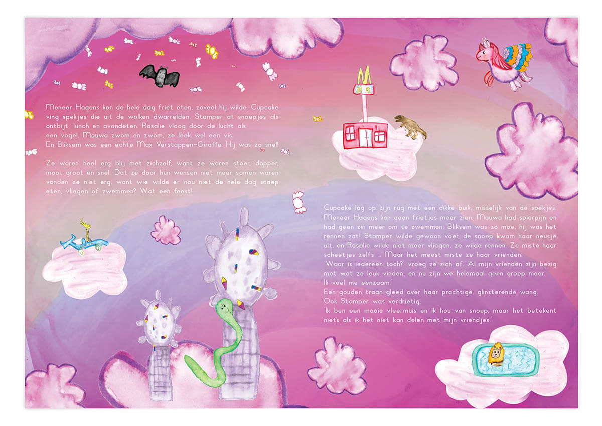
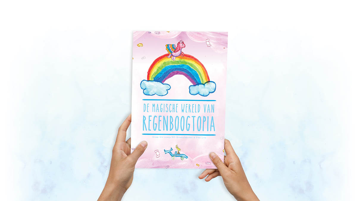
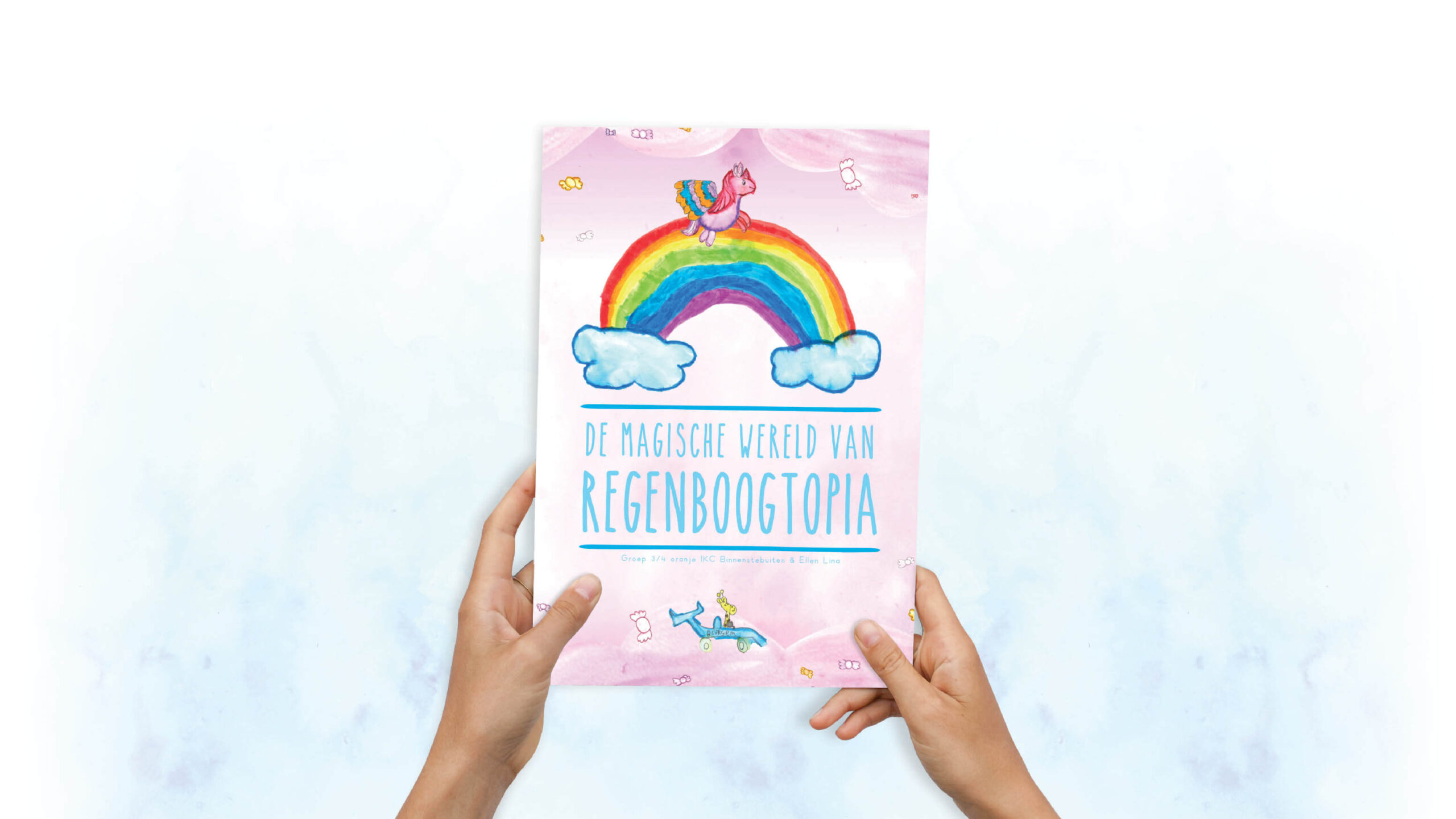
The concept we started with was the idea to make a children's book by children and for the children. Both the story and the images would be made by the children. All this guided by professionals in their own field. Ellen helped the children to clarify the story and I was there for the visual guidance and to ensure that the book was print-ready.

The most important condition was that the children had as much freedom as possible to create as they see fit. This placed a lot of responsibility on the children. I found it very exciting myself, since I would make a visual translation of the story of all the drawings. The fact that the drawings poured in from 24 different little creatives could make it a challenge. And it was. Fortunately. How wonderful it is when you see the project grow while working on it.

The design process was set up as it normally would. A rough sketch and a couple of pages elaborated to really get a good impression. This was shared with the entire team and I have never had such an enthusiastic meeting. The children were so proud of what they had made and full of wonder how it all comes about.

To make it complete, an official book release has been organized at school. Here, family and friends could purchase the book after the presentation, thanking each team member for his or her effort.

Client TESTIMONIAL

When we started the project, the first person I could think of to help us with the graphics was Koen. I know his work and his style and I knew - since Koen is the most enthusiastic person I know - that he would make something really beautiful of what we delivered: almost 50 drawings. All in different sizes and shapes. It seemed impossible to create something cohesive, but he did a wonderful job. Just as I thought. Everybody was positively surprised about the final result. It was far above everyone's imagination.Of course, we had an idea, but that it would turn out the way it did... We did not expect that. With more projects to come in collaboration with different elementary schools, Koen is the first I would ask to help again. He is a true pro.

Ellen Lina

Writer

Thanks for watching

Hope you enjoyed it

Categories
Work

Filt wear

Case study

Filt wear

My role

Graphic & package design
Project management

CLIENT

Filt wear

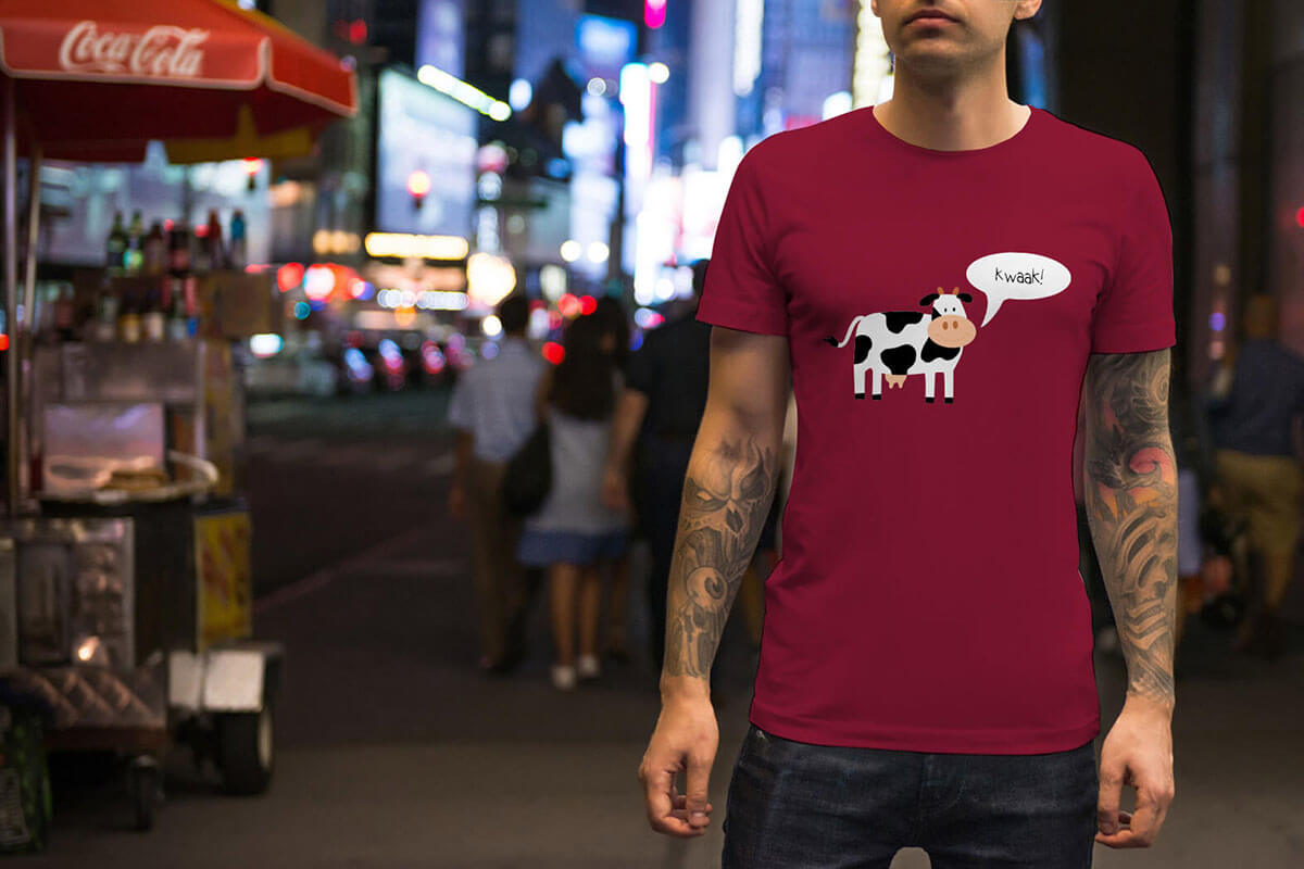
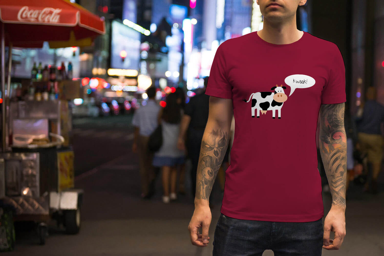
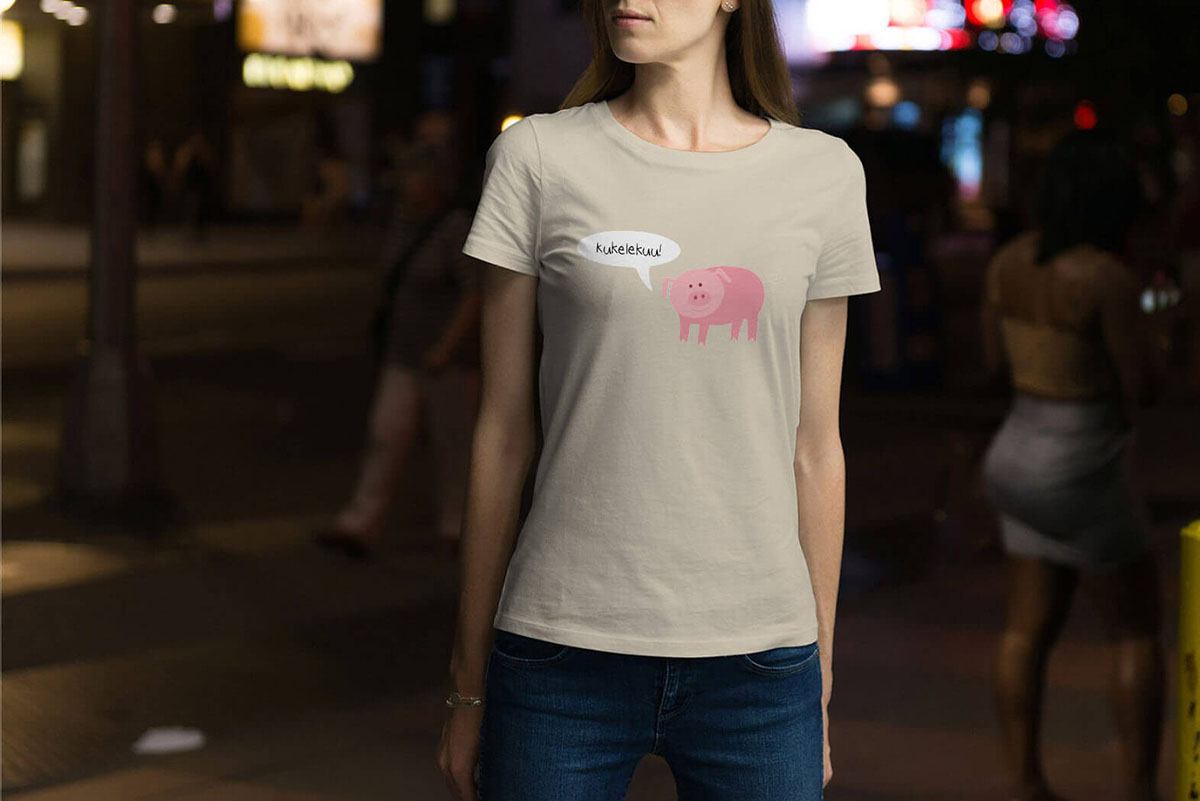
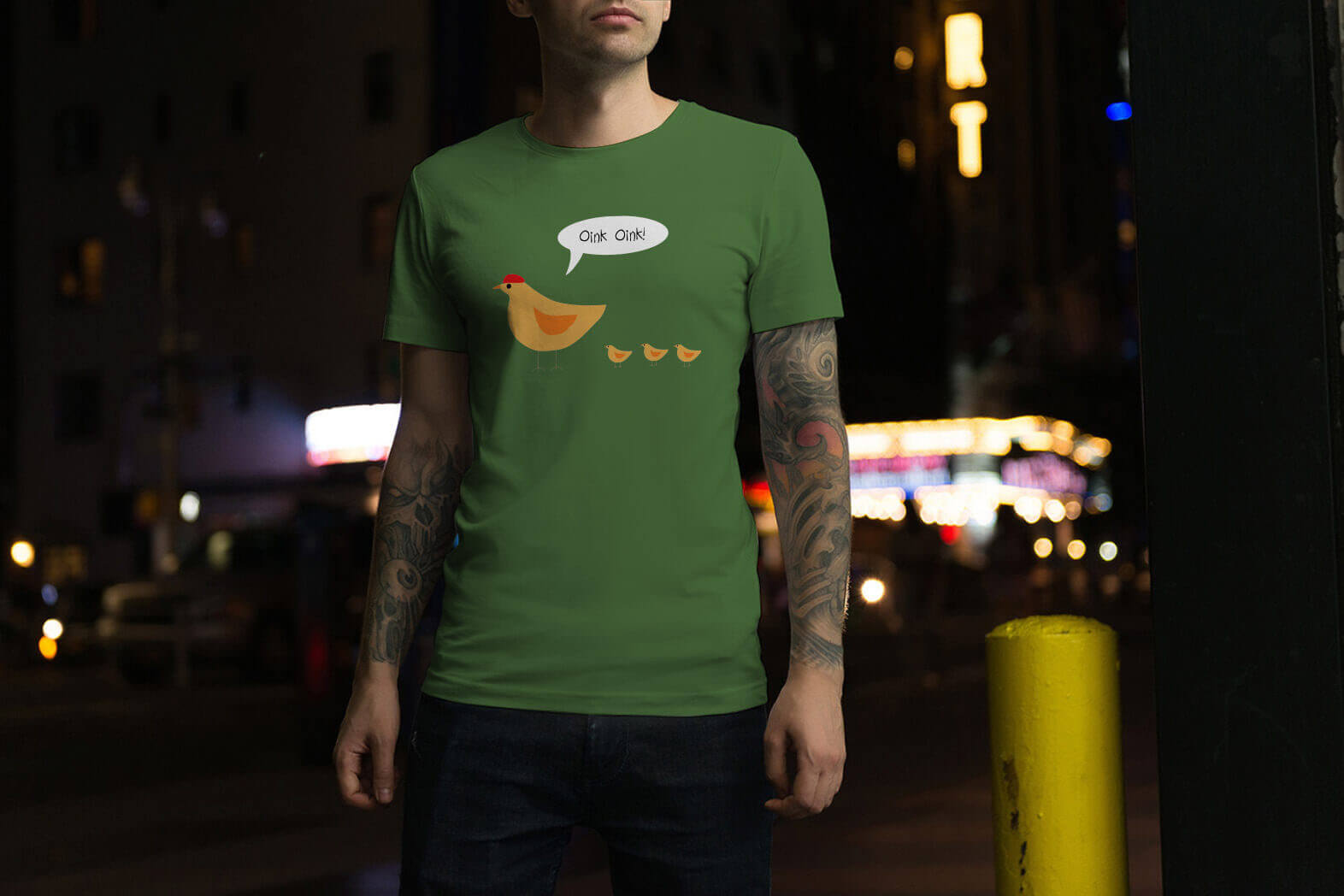
At a time where we are digitizing more and more and getting further away from nature with every generation growing up, it is good to keep tightening this link. Filt Wear, a sustainable brand, tries to get that message back to the attention of the youth. Not in a nagging way, but rather with subjects that are so exaggerated that they become comical without losing the message.

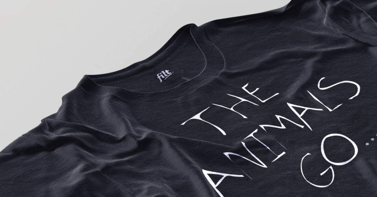
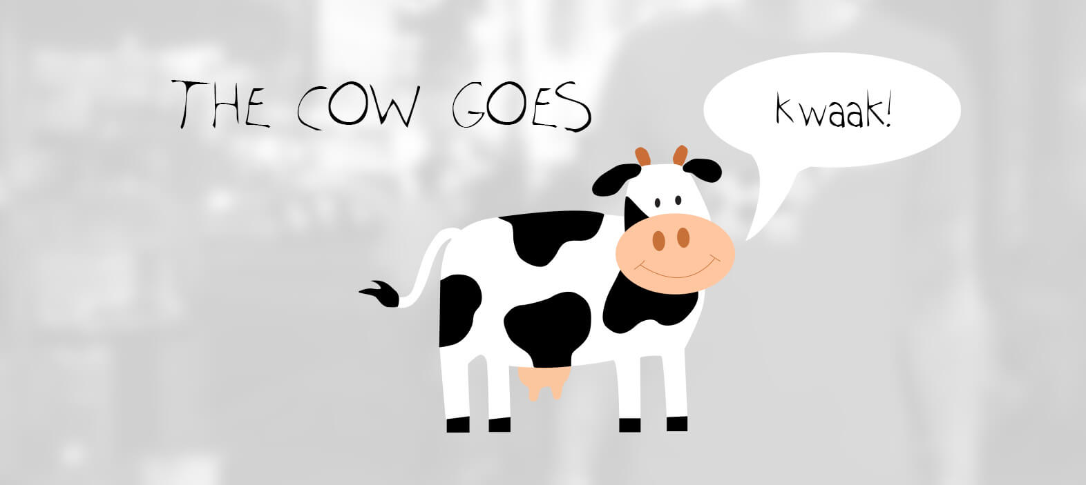
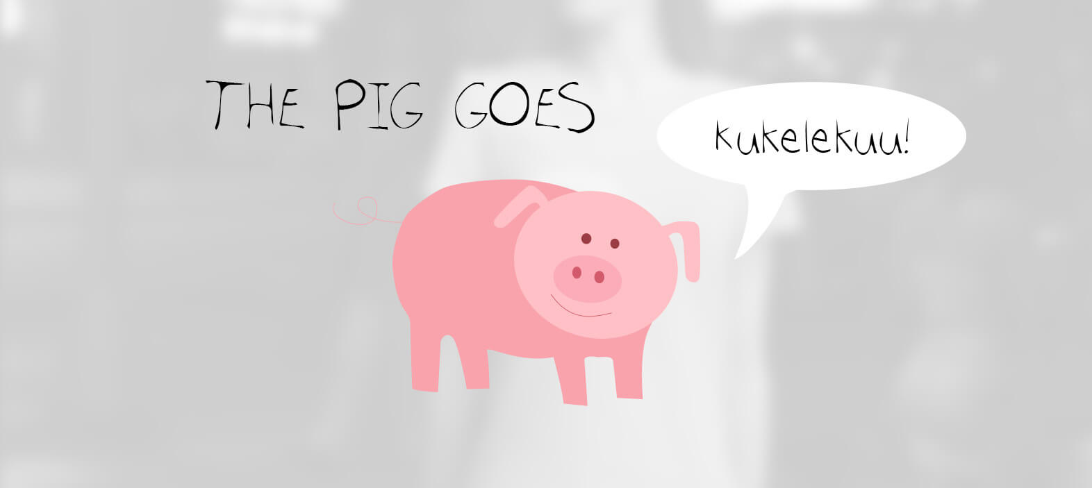
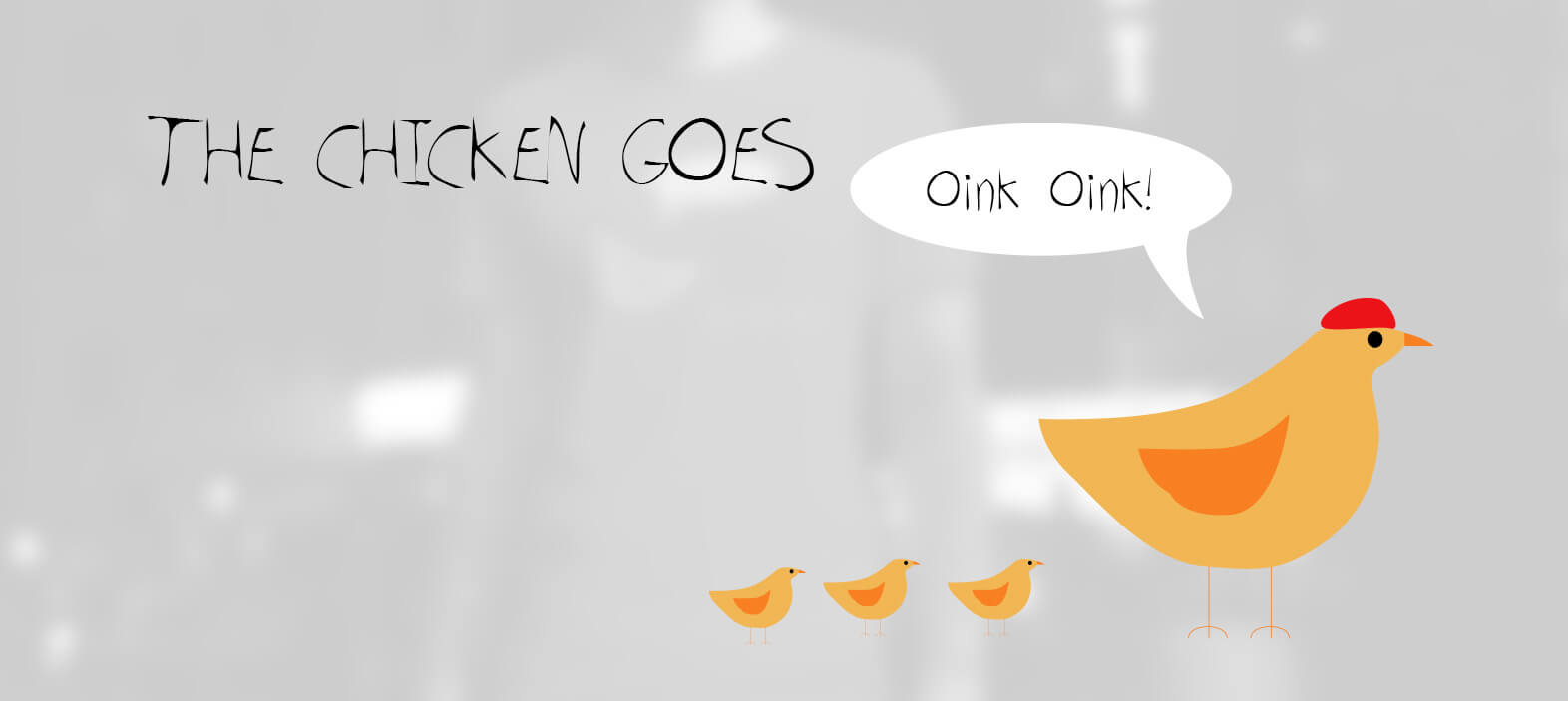
For Filt Wear I was able to devise and develop several concepts. One of the stronger ones is "The animal goes". We all know it as a simple learning game for children and of course we all know well what sound every animal should make. But thanks to the clear concept and minimalist design, the message is immediately clear and comes in without sacrificing positivity just by switching the sounds.

Thanks for watching

Hope you enjoyed it

Categories
Work

ABC Real Estate

Case study

ABC Real Estate

My role

UI design
Wordpress development

Client

ABC Real Estate / Home owner

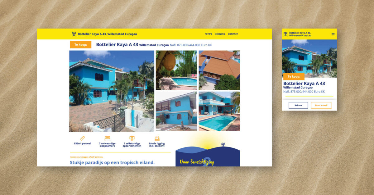
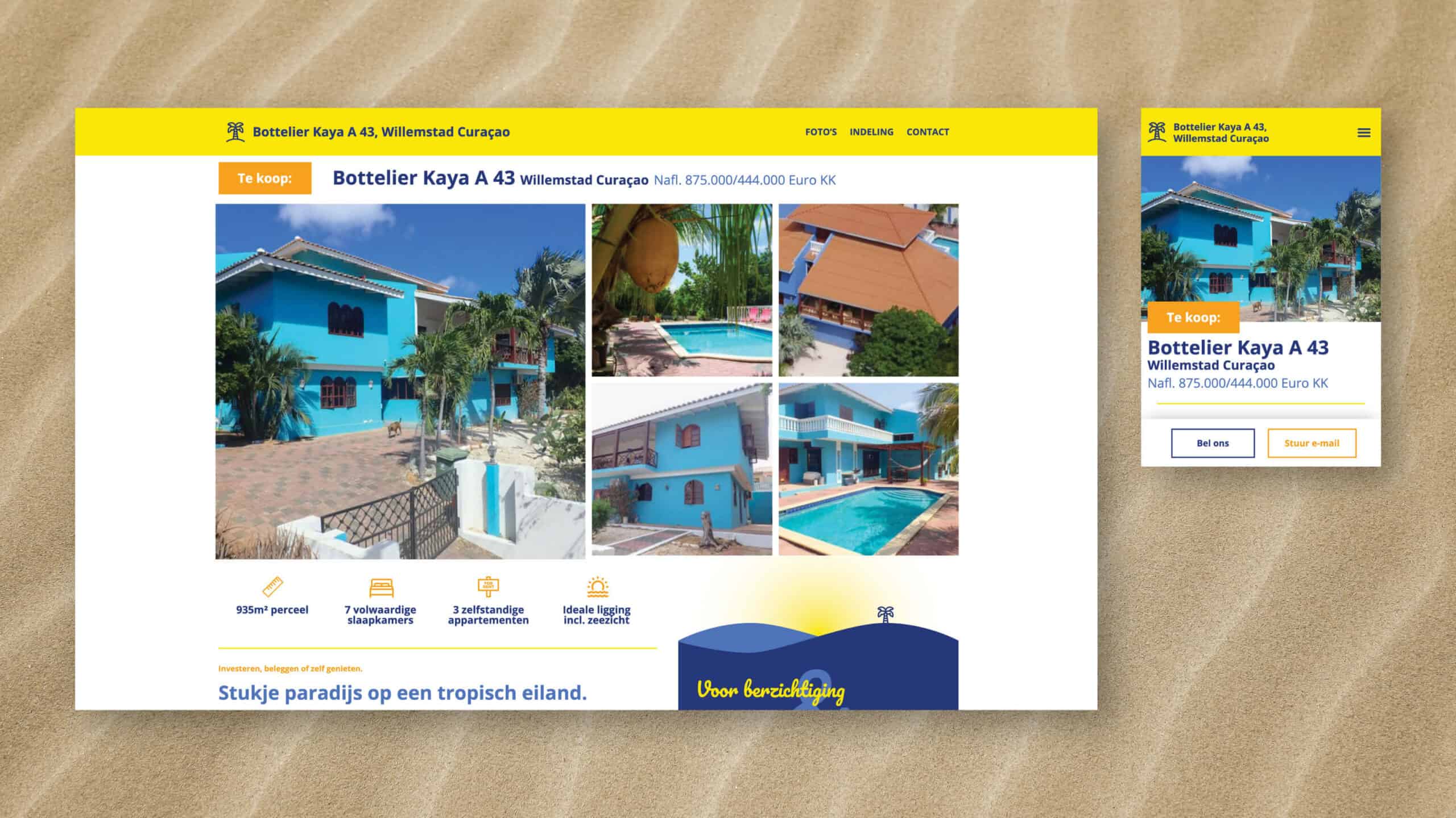
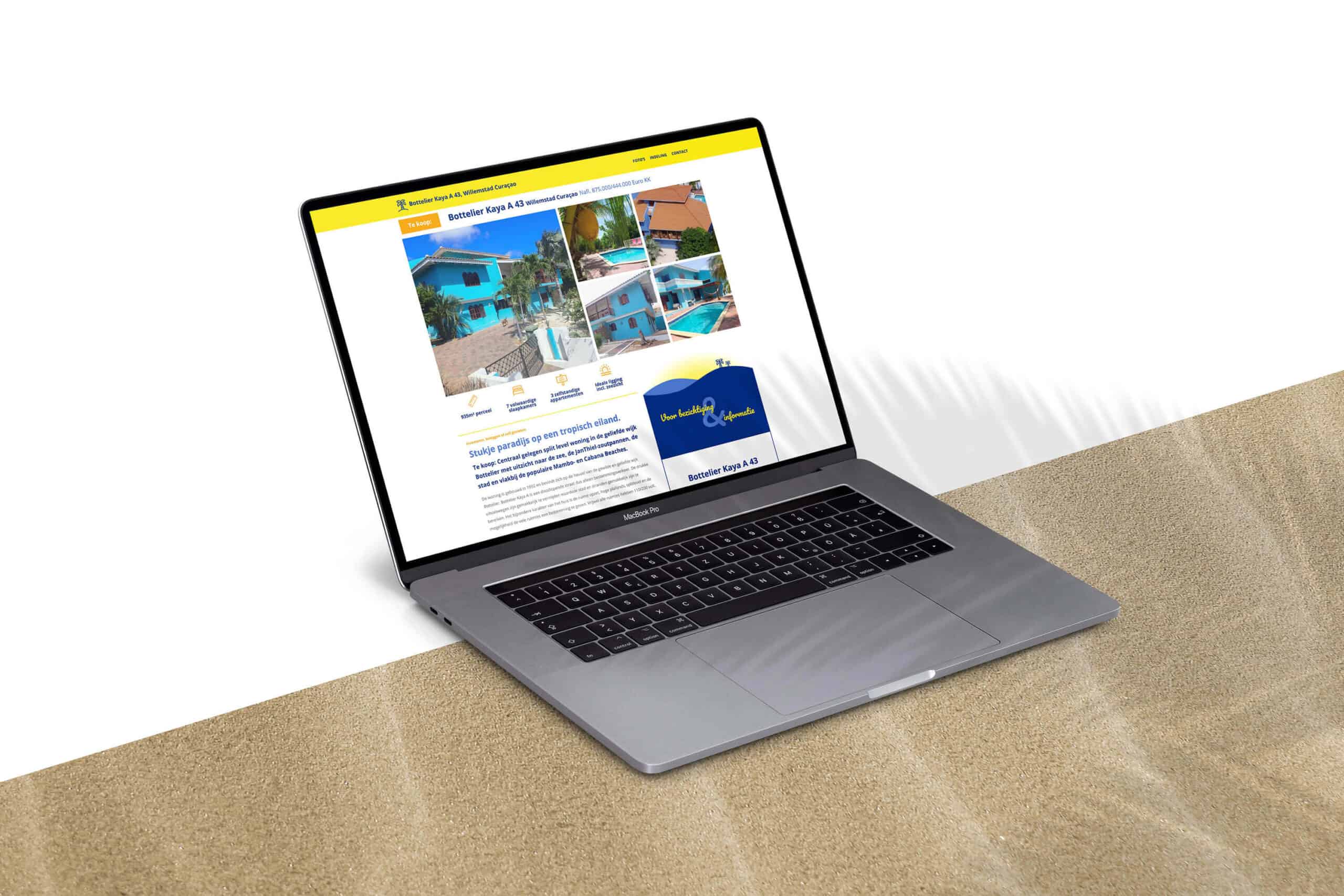
The home owners of Bottelier Kaya A 43 had their house for sale. The current sales channels did not do justice to this characteristic house. In consultation with the owners of the house, the idea arose to design a website that combines the atmosphere of the island and that of the house in a functionally strong and clear web design.

During this project I enjoyed a lot of freedom so I could create a real cohesion between functionality and design.

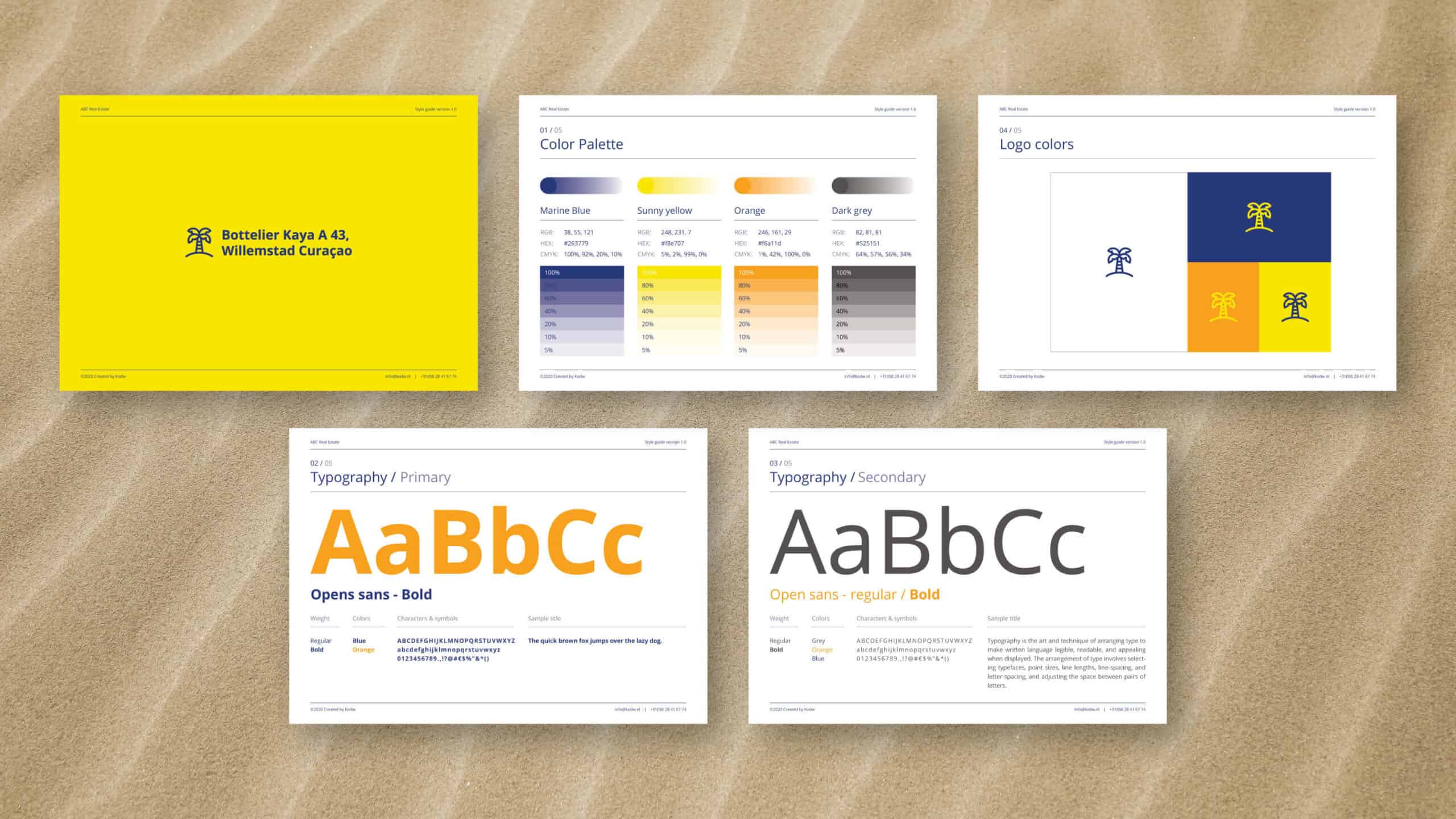
For the corporate identity, the choice was made to use the colors of Curaçao's flag as a guideline. The combination of a playful font with a good, strong and legible font ensures that the sunny and cheerful atmosphere of the island also was felt while reading. All without affecting the legibility.

The homepage contains all the necessary information and should suffice. But to make sure people understand the architecture of the house, we decided to dedicate an extra page to a photo tour of the house and a page explaining the layout using floor plans.

Client TESTIMONIAL

I asked Koen if it was possible to make a presentation of our house we’re selling. Personally I was not impressed by the presentations of the houses made by brokers for their website.

Koen came with a very original en colorful web design showing our house in the right proportions. Because it’s a split level house it’s not easy to visualize the complexity of the structure. But, great job, every level is explained well with text, pictures and maps. With our new website launched and linked to the broker's website, we see an increasing amount of interest in our house. Lots of visitors but no buyers yet. Probably daydreamers dreaming living in such a house under the Caribbean sun!

Ferdinand Rink

Home owner

Thanks for watching

Hope you enjoyed it